5 Tips for Better Compose Previews
We take a look at a few advanced concepts that help us get the most out of compose previews.
Compose Previews enable us to visualize our composable functions simply and quickly. However, they also support more advanced concepts that can help us test our UI for different device configurations, cover various input data, and organize our previews.
We’ll look at a few of these concepts by creating previews in the nowinandroid sample app.
Use a custom annotation class
We can use a custom annotation class to generate multiple previews using a single preview annotation.
1
2
3
4
5
6
7
8
9
10
11
12
13
@Preview(
    name = "small font",
    fontScale = 0.5f,
)
@Preview(
    name = "normal font",
    fontScale = 1f,
)
@Preview(
    name = "large font",
    fontScale = 1.5f,
)
annotation class FontScalePreviews
Then we can use it as a regular preview annotation.
1
2
3
4
5
@FontScalePreviews
@Composable
private fun InterestsCardLongNamePreview() {
    InterestsItem()
}
This generates three previews with different font sizes applied. This is called a MultiPreview annotation.
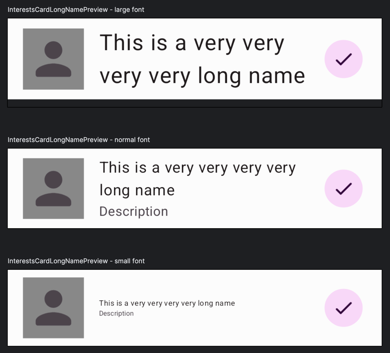 The result of applying a single annotation with three previews
Compose also provides a few existing MultiPreview annotations that we can use:
PreviewDynamicColors: for displaying a Composable using four different wallpaper colorsPreviewFontScale: for displaying a Composable using seven standard font sizesPreviewLightDark: for displaying a Composable using light and dark themesPreviewScreenSizes: for displaying a Composable using the screen sizes of five different reference devices
Group together similar previews
We can use the group property of a Preview to visually group similar previews in the preview window.
Here is an example of three previews that use a different font size. We provide different names for them, but use the same group: “font scales”.
1
2
3
4
5
6
7
8
9
10
11
12
13
14
15
16
@Preview(
    name = "small font",
    group = "font scales",
    fontScale = 0.85f,
)
@Preview(
    name = "normal font",
    group = "font scales",
    fontScale = 1f,
)
@Preview(
    name = "large font",
    group = "font scales",
    fontScale = 1.15f,
)
annotation class FontScalePreviews
If we apply this preview annotation to our composable, we see three different previews, “large font”, “normal font” and “small font”. Additionally, we see previews for other composables. So how did the group property help us?
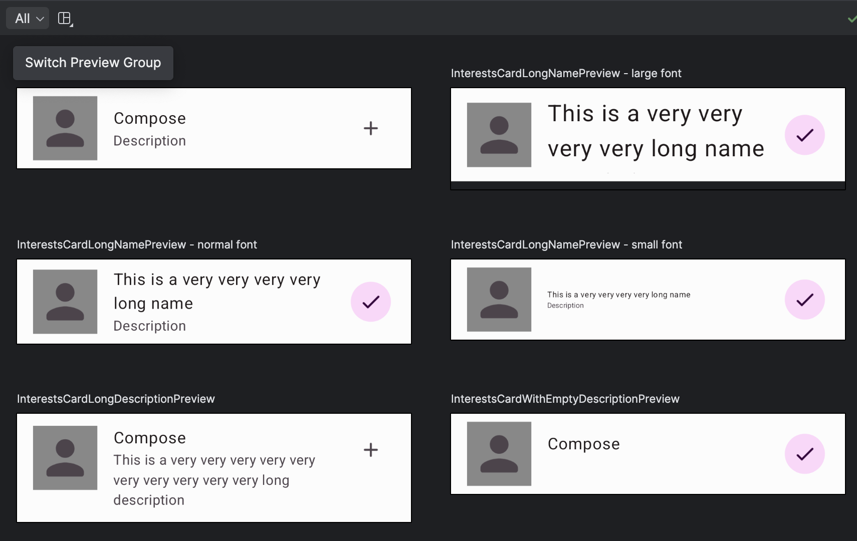 Showing all previews
Well, in the top left corner of the preview window, we can see a dropdown menu with the “All” option currently selected. This means that all previews in the current file are visible. But since we defined a group, we can click on “All” and select our group name, “font scales”. This filters out the previews that belong to this group and displays them.
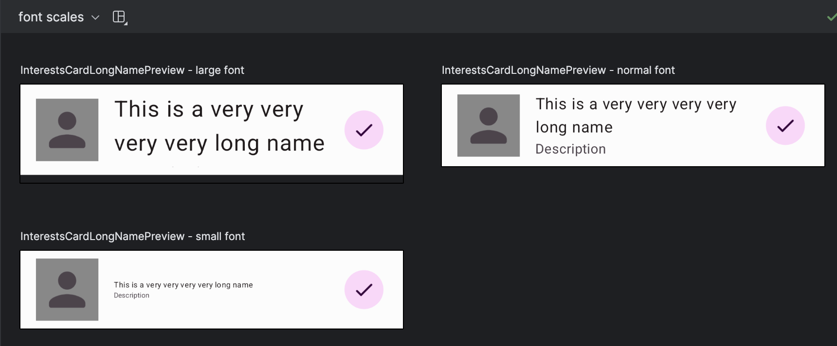 Showing only the previews belonging to a group
This is helpful when we have many previews and want to group them contextually.
Preview landscape composables
Compose previews typically show a composable in the portrait orientation. If we want to see how our composables are rendered in landscape orientation, or if we have orientation-specific composables that look different for portrait vs landscape orientations, we can leverage a custom device.
We can provide a string for the device property of the Preview annotation. There we can specify the dimensions of the screen. We have to provide a larger width than height to emulate a landscape mode.
1
@Preview(name = "Landscape", device = "spec:shape=Normal,width=640,height=360,unit=dp,dpi=480")
The above annotation will result in the landscape preview on the left. The right preview shows the standard portrait preview.
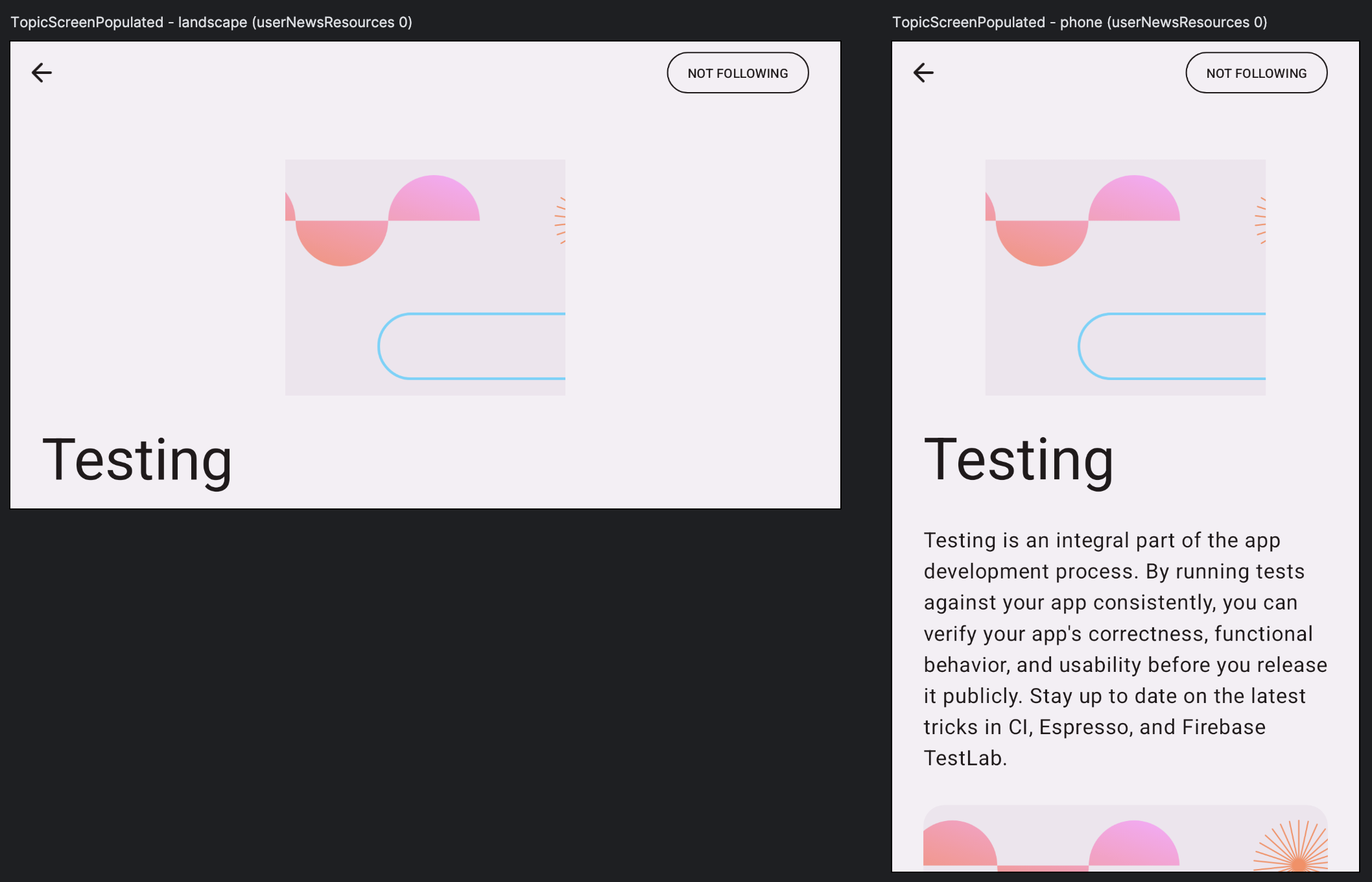 Landscape and portrait previews
Detect when running previews
We can use LocalInspectionMode.current to detect when our composable is run for the preview. This allows us to make changes that apply only to the preview, like skipping animations, side effects, or other features not supported by the previews. We can also load a placeholder image instead of loading an image from a URL, which is not previewable.
1
2
3
4
5
6
7
8
9
10
11
12
13
14
15
16
17
18
19
20
21
22
23
24
@Composable
private fun InterestsIcon(
    topicImageUrl: String,
    modifier: Modifier = Modifier,
) {
    if (LocalInspectionMode.current) {
        // use a placeholder icon in preview mode
        Icon(
            modifier = modifier
                .background(Color.Gray)
                .padding(4.dp),
            imageVector = NiaIcons.Person,
            // decorative image
            contentDescription = null,
        )
    } else {
        // load actual image in non-preview mode
        DynamicAsyncImage(
            imageUrl = topicImageUrl,
            contentDescription = null,
            modifier = modifier,
        )
    }
}
With the above check, the previews show an icon with a gray background instead of the remote image.
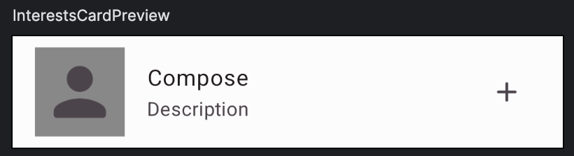 Preview for the interest card composable
However, when we run the app on a device, we see the actual image.
 Interest card composable when run on a device
Generate composable previews for different values
What if we wanted to preview a composable with different input data? Maybe our composable can render loading, success, and error states. Should we write three separate preview functions? What if we then want to use different data to test our success state?
1
2
3
4
5
6
7
8
9
10
11
12
13
14
15
16
17
18
19
20
21
22
23
sealed interface InterestItemState {

    data object Loading: InterestItemState

    data class Success(
        val name: String,
        val description: String,
        val following: Boolean,
        val topicImageUrl: String,
        val isSelected: Boolean,
    ): InterestItemState

    data object Error: InterestItemState
}

@Composable
fun InterestsItem(
    state: InterestItemState,
    onClick: () -> Unit,
    onFollowButtonClick: (Boolean) -> Unit,
) {
    ...
}
We can pass sample data to a preview composable function by adding arguments and tagging them with the @PreviewParameter annotation. This annotation accepts a PreviewParameterProvider class that is responsible for providing sample data.
Here’s an example of a preview function that accepts a state argument provided using a InterestItemPreviewStateProvider class. We then pass this argument to our composable function.
1
2
3
4
5
6
7
8
9
10
11
12
13
14
15
@Preview
@Composable
private fun InterestItemPreview(
    @PreviewParameter(InterestItemPreviewStateProvider::class) state: InterestItemState,
) {
    NiaTheme {
        Surface {
            InterestsItem(
                state = state,
                onClick = { },
                onFollowButtonClick = { },
            )
        }
    }
}
InterestItemPreviewStateProvider is a class that implements PreviewParameterProvider interface and returns a sequence of sample data. In our case, these are loading, error, and two success state objects with different values.
1
2
3
4
5
6
7
8
9
10
11
12
13
14
15
16
17
18
19
20
private class InterestItemPreviewStateProvider : PreviewParameterProvider<InterestItemState> {
    override val values: Sequence<InterestItemState> = sequenceOf(
        InterestItemState.Loading,
        InterestItemState.Error,
        InterestItemState.Success(
            name = "Compose",
            description = "Latest news on Jetpack Compose",
            following = true,
            topicImageUrl = "",
            isSelected = true,
        ),
        InterestItemState.Success(
            name = "Architecture",
            description = "Stay up-to-date with with the latest architecture news",
            following = false,
            topicImageUrl = "",
            isSelected = false,
        )
    )
}
Compose then takes each value and calls our preview function with that value, generating a preview. That means we ended up with four previews and only wrote one preview function.
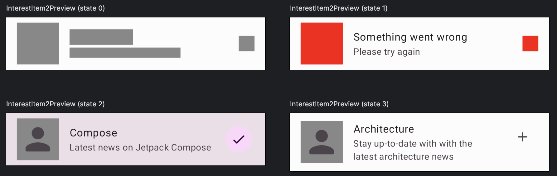 Generated previews for each of the values we provided.
This is helpful when there is a need to preview different states or pass a large dataset to a composable preview.
Conclusion
Adding a preview to our composables is a great and easy way to speed up development and boost developer productivity since it allows us to visualize the layouts and code changes.
It’s also an easy way to preview different screen configurations and font sizes without having to run the app on multiple devices with different settings. Additionally, by leveraging preview parameters, we can provide sample data to automatically generate previews for different states.
I hope you found this post useful and please share your tips on how to improve compose previews.
Resources: