Exploring the Official Pager Composable in Jetpack Compose
Let’s take a closer look at the recently released Pager composable and how to use it.
With the release of version 1.4, Jetpack Compose has officially received support for a paging layout. While this is something the View-based system has had for a long time in the form of a ViewPager widget, the developers had to use the Accompanist library implementation to achieve a similar effect with Compose.
There are two new composables available, HorizontalPager and VerticalPager. Let’s take a closer look at their usage and behavior.
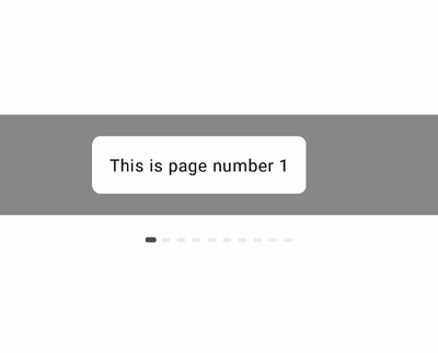
HorizontalPager
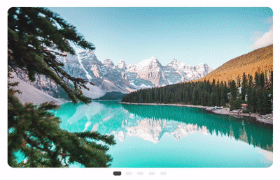
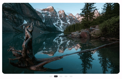
HorizontalPager is a composable that allows scrolling horizontally left and right, either by the user or programmatically.
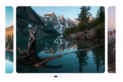 Horizontal scrolling Pager.
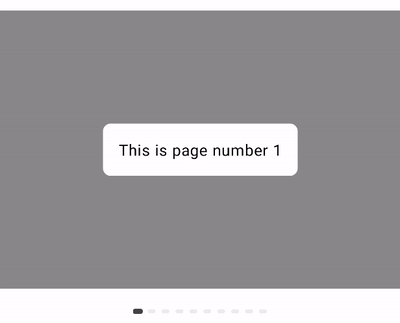
VerticalPager
VerticalPager is a composable that allows scrolling vertically up and down, either by the user or programmatically.
 Vertical scrolling Pager.
Taking a Closer Look
Pages/items are lazily composed and laid out when needed, similar to LazyColumn and LazyRow composables. All of these composables use LazyList internal composable under the hood.
Both pager composables are a wrapper around the internal Pager composable with a different value passed for the orientation argument.
Note that this API is marked as experimental at the time of writing this and it might change.
All arguments, apart from pageCount are optional:
pageCount: total number of pages/items this pager will display.pageSize: defines the size of a page inside the pager.pageSpacing: defines the padding between two pages inside the pager.contentPadding: specifies how pages are aligned inside the pager.beyondBoundsPageCount: specifies how many pages are loaded beyond the currently visible one.state: aPagerStateobject we can specify to control the pager and observe different properties, like the currently selected page.flingBehavior: defines how scroll gestures should behave.reverseLayout: reverses the layout and direction of scrolling. Meaning that the first page is shown as the last page and you have to scroll toward the start of the pager, instead of toward the end as normally.key: a stable and unique key to represent the item. We can use this to maintain the scroll position even when adding or removing items.
We’ll take a closer look at how passing different values to these arguments affects the behavior of the pager.
Page Size
The pageSize: PageSize argument allows us to control the size of the pages. By default, this is set to PageSize.Fill, which means that each page will take either the full width (for the HorizontalPager) or the full height (for the VerticalPager).
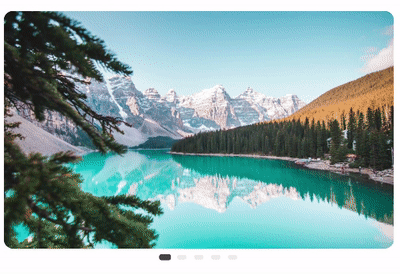 PageSize.Fill
We can use PageSize.Fixed(dp) to define a fixed size for a page.
 PageSize.Fixed(250.dp)
Sometimes we might need to define the size based on a custom calculation. We can do that by extending the PageSize interface and implementing the calculateMainAxisPageSize(availableSpace: Int, pageSpacing: Int) function. In the below example, we have a HorizontalPager that takes 80% of the available width, and we are setting the page size to 50% of the available width. This way we can show two pages at once.
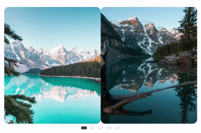 Custom page size calculation.
Page Spacing
With pageSpacing: Dp argument we can define the amount of space used between pages. Using the previous example of defining the pageSize as PageSize.Fixed(dp) and using 8.dp for spacing, we get the following result:
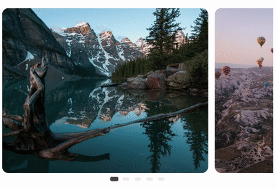 Page spacing on HorizontalPager.
 PageSpacing on VerticalPager.
Content Padding
With the contentPadding: PaddingValues argument we can control the positioning of the pages inside the pager.
Here we are setting equal padding to both the start and end properties, which centers the page in the middle of the pager. We are also applying vertical padding which in the case of the HorizontalPager adds equal padding to both the top and bottom of the pager.
 Applying ContentPadding to the HorizontalPager.
Applying the start padding only will result in pages being offset toward the end. Meaning that a part of the previous page is visible.
 Applying only the start padding.
Applying the end padding only will result in pages being offset toward the start. Meaning that a part of the next page is visible.
 Applying only the end padding.
The same principle applies to the VerticalPager with the difference that top, bottom, and vertical padding properties control the alignment of pages. Applying the top padding results in pages being offset towards the bottom. And applying the bottom padding results in pages being offset towards the top.
While start, end, and horizontal only apply the normal padding.
 Applying vertical padding to VerticalPager.
BeyondBoundsPageCount
This argument specifies how many pages/items should be loaded before and after the currently visible page, even when they are not visible. By default, the value is set to 0.
If we want a pager that wraps the height of the items and resizes for each item, then we can use Modifier.wrapContentHeight() on the HorizontalPager with beyondBoundsPageCount = 0.
 HorizontalPager with wrapContentHeight() and beyondBoundsPageCount = 0.
However, if we want the pager to wrap to the height of the tallest item, then we can specify beyondBoundsPageCount = pageCount.
 HorizontalPager with wrapContentHeight() and beyondBoundsPageCount = pageCount.
Note that setting this to a large value could result in lower performance, as per the documentation:
Be aware that using a large value for beyondBoundsPageCount will cause a lot of pages to be composed, measured and placed which will defeat the purpose of using lazy loading. This should be used as an optimization to pre-load a couple of pages before and after the visible ones.
Observing Page State Changes
Sometimes we would like to react to a page change as it happens. Either to send an analytics event, trigger some piece of logic or navigate to a different screen. We can do that by observing four properties of the PagerState object using snapshotFlowOf inside a LaunchedEffect:
currentPage: the currently selected page or the closest page to the snap position.targetPage: page that should be selected as a result of the scroll movement.settledPage: similar tocurrentPagebut remains unchanged until animations are finished.currentPageOffsetFraction: range from -0.5 to 0.5 specifies by how much the current page is offset from the snap position. Negative values are used when scrolling towards the start of the pager, and positive for towards the end. 0.0 means the current page is fully snapped.
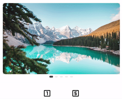
Creating a Page Indicator
Together with the Pager we usually want to display an indicator showing which page we are viewing and how many pages there are in total. There is no official page indicator composable available. However, it’s fairly straightforward to create one.
 Horizontal page indicator.
All we need is a Row (for a horizontal indicator) or a Column (for a vertical indicator) to place the individual page indicators. And we can use a Box or Icon or Image to render an indicator, based on our design requirements.
We can use the PagerState object to get the current page (pagerState.currentPage: Int), the target page (pagerState.targetPage: Int) which represents which page is going to be selected, and the scrolling offset (pagerState.currentPageOffsetFraction: Float), from which we can calculate and also animate the selection.
Here is an example of a horizontal pager indicator that shows the pages as a rectangle. We are also animating the size and color of the currently selected page indicator based on the current scrolling offset.
Scrolling to a Specific Page
We can programmatically scroll to a specific page in the pager, by creating a PagerState object, passing it to the pager, and then calling pagerState.scrollToPage(page: Int) or pagerState.animateScrollToPage(page: Int) inside a CoroutineScope.
 Programmatically scrolling to a specific page.
Using Pager with Tabs
We often need to use the pager together with tabs, displaying which tab is selected and allowing selection either by scrolling or clicking on a specific tab. We can achieve this by using TabRow composable together with a HorizontalPager.
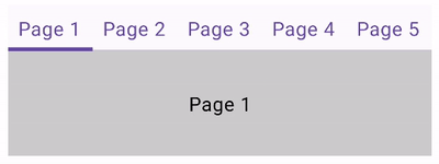 Using Pager with TabRow.
We need to create a TabRow composable and pass pagerState.currentPage to its selectedTabIndex argument. That way the selected tab can be updated as we scroll the pager. In the example, we are using the default tab indicator TabRowDefaults.Indicator and applying the Modifier.tabIndicatorOffset modifier which draws and animates the default selected tab indicator.
Setting this is enough for the tabs to be selected as we scroll the pager. If we wish to also support clicking on the tab to select a page, then we have to call pagerState.animateScrollToPage(selectedTabIndex) function inside a coroutine scope.
Customizing the Scroll Behavior
We can change the default scroll behavior of the pager by providing a custom flingBehavior: SnapFlingBehavior to the pager. We also need to create a PagerState object.
pagerSnapDistance allows us to define how many pages a fling gesture can scroll past. By default, this is set to one page, however, we can override this using PagerSnapDistance.atMost(pages: Int). Here is an example of setting snap to scroll 2 pages.
 Result of setting pagerSnapDistance to 2 pages instead of default 1.
lowVelocityAnimationSpec defines the animation used when you scroll or fling slowly. We’ve set this to 5 seconds in our example, meaning that after a slow fling, the animation to select the next page will take 5 seconds long.
highVelocityAnimationSpec defines the animation used when you scroll or fling very fast.
snapAnimationSpec defines the animation used when finally snapping to a position. That would be when you either scroll enough that the next page is selected or scroll just a little so the current page remains selected. We’ve set this to 1 second in our example.
 Custom snap animation spec.
Accompanist Pager Migration
The Accompanist version of the Pager is now marked as deprecated. Google has provided a guide on migrating your codebase from the existing com.google.accompanist.pager.HorizontalPager to androidx.compose.foundation.pager.HorizontalPager, and from com.google.accompanist.pager.VerticalPager to androidx.compose.foundation.pager.VerticalPager.
See https://google.github.io/accompanist/pager/ for the full details on how to perform the migration.
Conclusion
With the release of the latest version of Jetpack Compose, we have received a new official Pager composable, that is easy to use and customize.
We’ve taken a look at different properties of the new composable and how they affect the behavior of the pager. Then we learned how to create our own page indicator, and how to use the pager together with tabs.
With this, there is no need for an additional library and it should enable developers to quickly implement designs that require pagers.
References:
- Official documentation: https://developer.android.com/jetpack/compose/layouts/pager
- Accompanist pager library: https://google.github.io/accompanist/pager/