Building a Space Flight News App with Compose Multiplatform for Android, iOS, and Desktop: Part 4 — Screen Navigation
The fourth part of building a Compose Multiplatform app: navigating to a details screen.
This is the fourth part of a series of articles focusing on Compose Multiplatform. We are building an app for Android, iOS, and Desktop that displays the latest Space Flight news.
This part will focus on the following:
- adding an article details screen,
- and navigating to it using Compose Navigation.
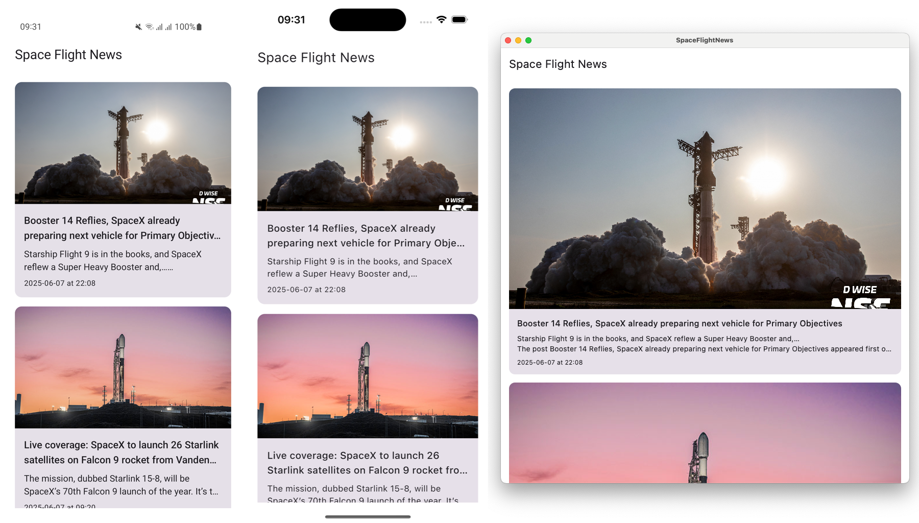
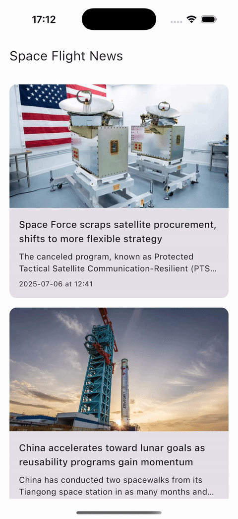
 Showcase of the final app.
Recap of the first three parts
This article continues where the third part left off, so make sure to start there if you haven’t yet: Building a Space Flight News App with Compose Multiplatform for Android, iOS, and Desktop: Part 3
So far, we’ve learned the following:
- how Kotlin Multiplatform works
- sharing UI using Compose Multiplatform on iOS, Android, and Desktop
- loading remote images with Coil
- adding network layer for fetching remote data with Ktor
- adding dependency injection with Koin
- handling loading and error states
- adding a local database and offline support with SQLDelight.
You can find the code after part 3, and what will be our starting point for this article, on the part-3 branch of the project repository: https://github.com/landomen/KMPSpaceFlightNews/tree/part-3
1. Add navigation
To later open a new screen, we first need to set up the navigation structure. We’re going to leverage the Navigation Compose library to navigate between the list and detail screen.
Add navigation library
Open the gradle/libs.versions.toml file and add the new library.
1
2
3
4
5
[versions]
androidx-compose-navigation = "2.9.0-beta03"

[libraries]
androidx-compose-navigation = { module = "org.jetbrains.androidx.navigation:navigation-compose", version.ref="androidx-compose-navigation" }
Next, let’s open the composeApp/build.gradle.kts file and declare the dependency in the commonMain source set.
1
2
3
commonMain.dependencies {
    implementation(libs.androidx.compose.navigation)
}
Define navigation routes
We need to declare the supported navigation routes or screens that the app can navigate to. To do that, we need to create serializable classes for each screen.
Let’s create a new file and sealed interface MainNavigationDestination in composeApp/commonMain/your.package.spaceflightnews/ui/navigation directory. It will have two sub-types, both of which need to be marked with @Serializable:
Homewhich is a simple data object used to represent the home screen (list of articles)Detailswhich is a data class representing the article detail screen and containing the article identifier argument
1
2
3
4
5
6
7
8
import kotlinx.serialization.Serializable

sealed interface MainNavigationDestination {
    @Serializable
    data object Home : MainNavigationDestination
    @Serializable
    data class Details(val articleId: Long) : MainNavigationDestination
}
Create a NavigationHost
Open the App file and create a new private composable function MainNavigationHost.
In Compose navigation, we start by defining a new NavHost, which is the main navigation composable. Inside it, we have to define the composables that should be displayed when a specific route is requested using the composable<Route> function. Finally, an instance of NavController is needed to navigate between routes.
1
2
3
4
5
6
7
8
9
10
11
12
13
14
15
16
17
18
19
20
21
22
import androidx.navigation.compose.NavHost
import androidx.navigation.compose.composable
import androidx.navigation.compose.rememberNavController

@Composable
private fun MainNavigationHost() {
    val navController = rememberNavController()
    NavHost(
        navController,
        startDestination = MainNavigationDestination.Home,
        modifier = Modifier.fillMaxSize()
    ) {
        composable<MainNavigationDestination.Home> {
            ArticleListScreen()
        }
        composable<MainNavigationDestination.Details> {
            Box {
                // TODO
            }
        }
    }
}
Next, we have to replace the direct call to ArticleListScreen in the App() composable function with a call to the new MainNavigationHost() composable function.
Trigger navigation
We want to open a new screen when the user clicks on an article. To do that, we have to add a click listener to each article and receive the callback inside the MainNavigationHost function so we can perform the navigation using the NavController.
Open the ArticleListScreen and scroll down to the ArticleItem composable function. Add a click callback as a new argument that sends the id of the article that was clicked. Next, call the new onArticleClick callback inside the onClick function of the Card composable and pass in the article.id.
1
2
3
4
5
6
7
8
9
10
11
12
@Composable
private fun ArticleItem(
    article: Article,
    onArticleClick: (Long) -> Unit
) {
    Card(
        modifier = Modifier.fillMaxWidth(),
        onClick = { onArticleClick(article.id) }
    ) {
        ...
    }
}
Next, scroll up to ArticleListContent and add the same onArticleClick callback as an argument. Pass that argument forward to ArticleItem.
1
2
3
4
5
6
7
8
9
10
11
12
13
14
15
16
@Composable
private fun ArticleListContent(
    articles: List<Article>,
    onArticleClick: (Long) -> Unit
) {
    LazyColumn(
        ...
    ) {
        items(articles) { article ->
            ArticleItem(
                article = article,
                onArticleClick = onArticleClick,
            )
        }
    }
}
We now need to add that same callback argument to the ArticleListScreen composable function and pass it to the ArticleListContent function.
1
2
3
4
5
6
7
8
9
10
11
12
@Composable
internal fun ArticleListScreen(onArticleClick: (Long) -> Unit) {
    ...
            is ArticleListViewState.Success -> {
                val articles = currentState.articles
                ArticleListContent(
                    articles = articles,
                    onArticleClick = onArticleClick,
                )
            }
    ...
}
And finally, go back to the App file and implement the callback in MainNavigationHost. We’ve now successfully returned the callback from the child article card to the main app composable.
1
2
3
4
5
composable<MainNavigationDestination.Home> {
    ArticleListScreen(onArticleClick = {
        // TODO open details screen
    })
}
We can now use navController to trigger navigation to the Details route.
1
2
3
4
5
composable<MainNavigationDestination.Home> {
    ArticleListScreen(onArticleClick = { articleId ->
        navController.navigate(MainNavigationDestination.Details(articleId))
    })
}
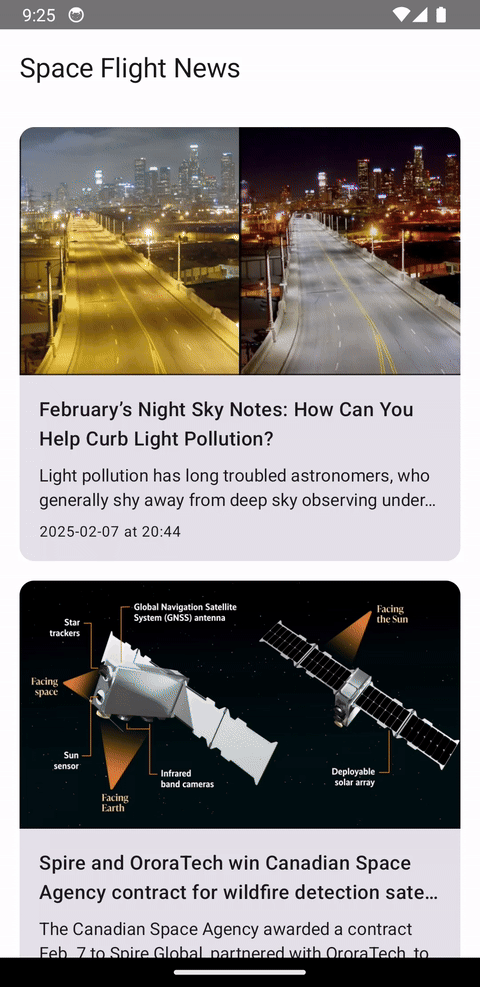
If we run the app now and click on an article, an empty screen will open. Pressing the back button returns to the article list screen.
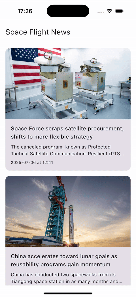
 Navigation to an empty screen after clicking on an article.
2. Add detail screen
Our app currently displays a list of news articles with a two-line description. Wouldn’t it be great to be able to read the whole article? To do that, we’ll add a new detail screen.
Create a new ArticleDetailsScreen file under the composeApp/commonMain/your.package.spaceflightnews/ui/details directory. For now, it should just have a single Composable function called ArticleDetailsScreen that accepts an articleId that will be used to load the data, and a onBackClick callback to navigate back to the list screen.
1
2
3
4
5
6
7
@Composable
internal fun ArticleDetailsScreen(
    articleId: Long,
    onBackClick: () -> Unit,
) {

}
Why are we passing only the article id to the details screen and not the whole Article object? It’s best practice to avoid passing complex data like objects to routes as it requires custom serialization and deserialization to and from strings. Since we have the data cached locally, it’s easy to retrieve it.
If we needed to make a network request to fetch the same data we already previously fetched, it would be worth considering passing in the whole object instead to avoid that expensive network request.
Create a ViewModel
Create a new class ArticleDetailsViewModel in the same directory. It should extend the ViewModel class and accept a ArticlesRepository as an argument.
1
2
3
internal class ArticleDetailsViewModel( private val repository: ArticlesRepository,) : ViewModel() {

}
We will need to load the data from the database based on the article identifier, which should be fast. However, it’s still a good practice to handle loading and error states. For that purpose, let’s define a ArticleDetailsViewState sealed interface at the bottom of the ArticleDetailsViewModel class.
1
2
3
4
5
6
7
8
9
10
internal class ArticleDetailsViewModel(
    private val repository: ArticlesRepository,
) : ViewModel() {

    sealed interface ArticleDetailsViewState {
        data object Loading : ArticleDetailsViewState
        data class Success(val article: Article) : ArticleDetailsViewState
        data class Error(val errorType: ErrorType) : ArticleDetailsViewState
    }
}
As is necessary for the UI to observe the state changes, let’s define a MutableStateFlow property to propagate the changes to the UI.
1
2
3
4
5
6
7
8
9
10
11
12
13
internal class ArticleDetailsViewModel(
    private val repository: ArticlesRepository,
) : ViewModel() {

    private val _state = MutableStateFlow<ArticleDetailsViewState>(ArticleDetailsViewState.Loading)
    val state: StateFlow<ArticleDetailsViewState> = _state

    sealed interface ArticleDetailsViewState {
        data object Loading : ArticleDetailsViewState
        data class Success(val article: Article) : ArticleDetailsViewState
        data class Error(val errorType: ErrorType) : ArticleDetailsViewState
    }
}
All that‘s missing now is the actual logic to fetch the article from the database based on the id. To do that, create a new function onFetchArticle(id: Long) that will be called by the UI and load the data.
We’re starting with a loading state, then if the article is found (which it should be in most cases), we emit a success state. If the article is not found or an exception happens, we emit an error state.
1
2
3
4
5
6
7
8
9
10
11
12
13
14
15
fun onFetch(id: Long) {
    viewModelScope.launch {
        _state.value = ArticleDetailsViewState.Loading
        try {
            val article = repository.getArticleById(id)
            if (article != null) {
                _state.value = ArticleDetailsViewState.Success(article)
            } else {
                _state.value = ArticleDetailsViewState.Error(ErrorType.Unknown)
            }
        } catch (_: Exception) {
            _state.value = ArticleDetailsViewState.Error(ErrorType.Unknown)
        }
    }
}
Our View Model is now ready to use.
Provide ViewModel via dependency injection
To use the new ViewModel, we have to make it available via Koin. Process is the same as how we added the existing ArticleListViewModel in part 2.
Open AppModule and provide the ArticleDetailsViewModel via the viewModel function.
1
2
3
4
5
6
7
8
9
10
11
12
13
val appModule = module {
    single<ApiService> { ApiService() }
    single<ArticlesRepository> {
        ArticlesRepository(
            databaseDriverFactory = get(),
            api = get()
        )
    }

    viewModel { ArticleListViewModel(repository = get()) }
    // NEW: provide the newly added ArticleDetailsViewModel
    viewModel { ArticleDetailsViewModel(repository = get()) }
}
Setup icons and strings
Before we start writing our article details screen UI, we need to add some icons and strings. Because Compose doesn’t include icons as standard, we need to add the Compose Icons Extended dependency to our project.
As you’re probably already used to, open the gradle/libs.versions.toml file and add the new library.
1
2
3
4
5
[versions]
androidx-material-icons-extended = "1.7.3"

[libraries]
androidx-material-icons-extended = { module = "org.jetbrains.compose.material:material-icons-extended", version.ref = "androidx-material-icons-extended" }
Next, let’s open the composeApp/build.gradle.kts file and declare the dependency in the commonMain source set. Make sure to perform a new gradle sync afterwards.
1
2
3
commonMain.dependencies {
    implementation(libs.androidx.material.icons.extended)
}
For the new strings, open the composeApp/src/commonMain/composeResources/values/strings.xml file and add the following new strings. The %1$s is a string placeholder that we will later replace with the name of the news site.
1
2
3
<string name="read_more_at">Read full article at %1$s</string>
<string name="back_content_description">Back</string>
<string name="share_content_description">Share</string>
Tip: If you find you can not reference the strings from code later, rebuild the app.
Define the details UI
Let’s start by getting an instance of the ArticleDetailsViewModel and reading the state from it inside the ArticleDetailsScreen composable function.
1
2
3
4
5
6
7
8
@Composable
internal fun ArticleDetailsScreen(
    articleId: Long,
    onBackClick: () -> Unit,
) {
    val viewModel = koinViewModel<ArticleDetailsViewModel>()
    val state by viewModel.state.collectAsStateWithLifecycle()
}
Next, we need to propagate articleId to the View Model. One way would be to use a SavedStateHandle to read the argument directly in the ArticleDetailsViewModel. However, to keep things simple, we’re just going to use a LaunchedEffect and call the viewModel.onFetchArticle() function.
1
2
3
4
5
6
7
8
9
10
11
12
@Composable
internal fun ArticleDetailsScreen(
    articleId: Long,
    onBackClick: () -> Unit,
) {
    val viewModel = koinViewModel<ArticleDetailsViewModel>()
    val state by viewModel.state.collectAsStateWithLifecycle()

    LaunchedEffect(Unit) {
        viewModel.onFetch(articleId)
    }
}
We’re going to keep the screen layout in a new Composable function called ArticleDetailsScreenContent. It should accept the screen state, and several callbacks for UI actions.
1
2
3
4
5
6
7
8
9
10
@Composable
private fun ArticleDetailsScreenContent(
    state: ArticleDetailsViewModel.ArticleDetailsViewState,
    onRetryClick: () -> Unit,
    onBackClick: () -> Unit,
    onShareClick: () -> Unit,
    onReadMoreClick: (String) -> Unit,
) {

}
For the actual screen, we’re going to use the Scaffold composable to handle the basic skeleton for us. We need to support loading, error, and success states.
1
2
3
4
5
6
7
8
9
10
11
12
13
14
15
16
17
18
19
20
21
22
23
24
25
26
@Composable
private fun ArticleDetailsScreenContent(
    state: ArticleDetailsViewModel.ArticleDetailsViewState,
    onRetryClick: () -> Unit,
    onBackClick: () -> Unit,
    onShareClick: () -> Unit,
    onReadMoreClick: (String) -> Unit,
) {
    Scaffold { innerPadding ->
        Box(modifier = Modifier.padding(innerPadding)) {
            when (val currentState = state) {
                is ArticleDetailsViewModel.ArticleDetailsViewState.Error -> {
                    // TODO
                }

                ArticleDetailsViewModel.ArticleDetailsViewState.Loading -> {
                    // TODO
                }

                is ArticleDetailsViewModel.ArticleDetailsViewState.Success -> {
                    // TODO
                }
            }
        }
    }
}
For the loading and error states, we’re going to reuse the same layouts from the ArticleListScreen. However, it would be bad practice to duplicate them, so we’ll extract them into standalone composable functions that we can then also reference on the new screen.
Open ArticleListScreen and create two functions: LoadingContent and ErrorContent. Copy over the content from the when statement and update the ErrorContent so that it receives the error type as input argument, and a callback for the retry button click. Make sure to update the when statement so it calls these two new functions.
1
2
3
4
5
6
7
8
9
10
11
12
13
14
15
16
17
18
19
20
21
22
23
24
25
26
27
28
29
30
31
@Composable
fun BoxScope.LoadingContent() {
    CircularProgressIndicator(modifier = Modifier.align(Alignment.Center))
}

@Composable
fun BoxScope.ErrorContent(
    errorType: ErrorType,
    onRetryClick: () -> Unit
) {
    val errorMessage = when (errorType) {
        ErrorType.NoInternet -> stringResource(Res.string.no_internet)
        ErrorType.ServerError -> stringResource(Res.string.server_error)
        ErrorType.Unknown -> stringResource(Res.string.something_went_wrong)
    }

    Column(
        horizontalAlignment = Alignment.CenterHorizontally,
        modifier = Modifier.align(Alignment.Center)
    ) {
        Text(
            text = errorMessage,
            color = Color.Red,
            style = MaterialTheme.typography.bodyMedium,
            modifier = Modifier.padding(16.dp)
        )
        Button(onClick = onRetryClick) {
            Text(text = stringResource(Res.string.retry))
        }
    }
}
We can now use the two new functions in the ArticleDetailsScreenContent.
1
2
3
4
5
6
7
8
9
10
11
12
13
14
15
16
17
18
19
20
21
22
23
24
25
26
27
28
29
@Composable
private fun ArticleDetailsScreenContent(
    state: ArticleDetailsViewModel.ArticleDetailsViewState,
    onRetryClick: () -> Unit,
    onBackClick: () -> Unit,
    onShareClick: () -> Unit,
    onReadMoreClick: (String) -> Unit,
) {
    Scaffold { innerPadding ->
        Box(modifier = Modifier.padding(innerPadding)) {
            when (val currentState = state) {
                is ArticleDetailsViewModel.ArticleDetailsViewState.Error -> {
                    ErrorContent(
                        errorType = currentState.errorType,
                        onRetryClick = onRetryClick,
                    )
                }

                ArticleDetailsViewModel.ArticleDetailsViewState.Loading -> {
                    LoadingContent()
                }

                is ArticleDetailsViewModel.ArticleDetailsViewState.Success -> {
                    // TODO
                }
            }
        }
    }
}
Next, we need to define the success UI. Create a new composable function named ArticleDetailsSuccessContent that accepts the loadedArticle object, and callbacks for back button, share button, and read more button clicks.
For the actual content, we want to display the following elements:
- cover image of the article
- back button shown on the top left of the image
- share button shown on the top right of the image
- article title
- name of the news site where the article was published
- date and time the article was published
- full description/content of the article
- “read more” button.
The image below shows the design we want to achieve. Feel free to try and do it yourself before moving forward.
 Article details screen layout on Android.
Here is the full implementation of ArticleDetailsSuccessContent based on the requirements above. We’re using a Column to vertically arrange all the elements.
Similar to the list screen, we’re using Coil’s AsyncImage to load the article image from the URL. We’re wrapping it in a Box, so we can overlay the back and share buttons over it.
The date and time at which the article was published is formatted using the LocalDateTime.Format builder, which gives us the option to specify the exact format we want.
1
2
3
4
5
6
7
8
9
10
11
12
13
14
15
16
17
18
19
20
21
22
23
24
25
26
27
28
29
30
31
32
33
34
35
36
37
38
39
40
41
42
43
44
45
46
47
48
49
50
51
52
53
54
55
56
57
58
59
60
61
62
63
64
65
66
67
68
69
70
71
72
73
74
75
76
77
78
79
80
81
82
83
84
85
86
87
88
89
90
91
92
93
94
95
96
97
98
99
100
101
@Composable
private fun ArticleDetailsSuccessContent(
    article: Article,
    onBackClick: () -> Unit,
    onShareClick: () -> Unit,
    onReadMoreClick: (String) -> Unit,
) {
    Column(
        verticalArrangement = Arrangement.Top,
        modifier = Modifier.fillMaxSize()
    ) {
        Box(modifier = Modifier.fillMaxWidth()) {
            AsyncImage(
                model = article.imageUrl,
                contentDescription = null,
                contentScale = ContentScale.Crop,
                modifier = Modifier
                    .fillMaxWidth()
                    .aspectRatio(16f / 9f),
            )

            IconButton(onClick = onBackClick, modifier = Modifier.align(Alignment.TopStart)) {
                Icon(
                    Icons.AutoMirrored.Filled.ArrowBack,
                    contentDescription = stringResource(Res.string.back_content_description),
                    tint = Color.White
                )
            }

            IconButton(onClick = onShareClick, modifier = Modifier.align(Alignment.TopEnd)) {
                Icon(
                    Icons.Default.Share,
                    contentDescription = stringResource(Res.string.share_content_description),
                    tint = Color.White
                )
            }
        }

        Column(
            verticalArrangement = Arrangement.spacedBy(8.dp),
            modifier = Modifier.fillMaxWidth().padding(16.dp)
        ) {

            Text(
                text = article.title,
                style = MaterialTheme.typography.titleLarge,
                fontWeight = FontWeight.Bold,
                overflow = TextOverflow.Ellipsis,
            )

            Row(
                verticalAlignment = Alignment.CenterVertically,
                horizontalArrangement = Arrangement.spacedBy(2.dp)
            ) {
                Text(
                    text = article.newsSite,
                    style = MaterialTheme.typography.bodySmall,
                    color = MaterialTheme.colorScheme.secondary,
                )
                Text(
                    text = " • ",
                    style = MaterialTheme.typography.bodySmall,
                    color = MaterialTheme.colorScheme.secondary,
                )
                Text(
                    text = article.publishedAt.toLocalDateTime(TimeZone.currentSystemDefault())
                        .format(
                            LocalDateTime.Format {
                                year()
                                char('-')
                                monthNumber()
                                char('-')
                                dayOfMonth()

                                chars(" at ")

                                hour()
                                char(':')
                                minute()
                            }),
                    style = MaterialTheme.typography.bodySmall,
                    color = MaterialTheme.colorScheme.secondary,
                )
            }

            Spacer(modifier = Modifier.height(8.dp))

            Text(
                text = article.summary,
                style = MaterialTheme.typography.bodyMedium,
                overflow = TextOverflow.Ellipsis
            )

            TextButton(onClick = {
                onReadMoreClick(article.url)
            }, modifier = Modifier.fillMaxWidth()) {
                Text(text = stringResource(Res.string.read_more_at, article.newsSite))
            }
        }
    }
}
Now that we have defined our success layout, we can go back to the ArticleDetailsScreenContent and update the success branch of the when statement to call the new ArticleDetailsSuccessContent.
1
2
3
4
5
6
7
8
9
10
11
12
13
14
15
16
17
18
19
20
21
22
23
24
25
26
27
28
29
30
31
32
33
34
@Composable
private fun ArticleDetailsScreenContent(
    state: ArticleDetailsViewModel.ArticleDetailsViewState,
    onRetryClick: () -> Unit,
    onBackClick: () -> Unit,
    onShareClick: () -> Unit,
    onReadMoreClick: (String) -> Unit,
) {
    Scaffold { innerPadding ->
        Box(modifier = Modifier.padding(innerPadding)) {
            when (val currentState = state) {
                is ArticleDetailsViewModel.ArticleDetailsViewState.Error -> {
                    ErrorContent(
                        errorType = currentState.errorType,
                        onRetryClick = onRetryClick,
                    )
                }

                ArticleDetailsViewModel.ArticleDetailsViewState.Loading -> {
                    LoadingContent()
                }

                is ArticleDetailsViewModel.ArticleDetailsViewState.Success -> {
                    ArticleDetailsSuccessContent(
                        article = currentState.article,
                        onBackClick = onBackClick,
                        onReadMoreClick = onReadMoreClick,
                        onShareClick = onShareClick,
                    )
                }
            }
        }
    }
}
And finally, we can call the ArticleDetailsScreenContent from the root ArticleDetailsScreen composable function.
1
2
3
4
5
6
7
8
9
10
11
12
13
14
15
16
17
18
19
20
21
22
23
24
25
26
@Composable
internal fun ArticleDetailsScreen(
    articleId: Long,
    onBackClick: () -> Unit,
) {
    val viewModel = koinViewModel<ArticleDetailsViewModel>()
    val state by viewModel.state.collectAsStateWithLifecycle()

    LaunchedEffect(Unit) {
        viewModel.onFetch(articleId)
    }

    ArticleDetailsScreenContent(
        state = state,
        onRetryClick = {
            viewModel.onFetch(articleId)
        },
        onBackClick = onBackClick,
        onShareClick = {
            // TODO Open share sheet
        },
        onReadMoreClick = {
            // TODO Open browser
        }
    )
}
We’re going to implement the share and read more functionality in next part of the series.
Add the composable to the navigation graph
Now that we have defined the ArticleDetailsScreen composable, we can add it to our navigation graph and open it.
Open the App and replace the Box with the TODO at the bottom of the file with a call to ArticleDetailsScreen. We passed the article identifier when we triggered the navigation to the details screen, and to retrieve it, we have to use the toRoute extension function on theNavBackStackEntry.
On back click, we call navController.popBackStack() which navigates back from the details screen to the list screen.
1
2
3
4
5
6
7
8
9
10
11
12
13
14
15
16
17
18
19
20
21
22
23
@Composable
private fun MainNavigationHost() {
    val navController = rememberNavController()
    NavHost(
        navController,
        startDestination = MainNavigationDestination.Home,
        modifier = Modifier.fillMaxSize()
    ) {
        composable<MainNavigationDestination.Home> {
            ArticleListScreen(onArticleClick = { articleId ->
                navController.navigate(MainNavigationDestination.Details(articleId))
            })
        }
        composable<MainNavigationDestination.Details> {
            val route = it.toRoute<MainNavigationDestination.Details>()
            ArticleDetailsScreen(
                articleId = route.articleId,
                onBackClick = {
                    navController.popBackStack()
                })
        }
    }
}
3. Run and test the app
All that is remaining is to run the app and try out the navigation.
 Navigating to the new details screen on iOS.
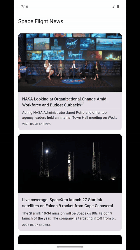
While the navigation itself works great — we can open and close a new details screen — there is a small design issue on the details screen. The top app bar showing the app name on the home screen is also visible on the details screen.
It’s taking up valuable vertical space and not offering much value on the details screen, so we’ll remove it. However, to do that, we need to change both how our main app and the ArticleListScreen are set up.
Move the Scaffold from App to ArticleListScreen
The reason why the top app bar is visible on both screens is that we use a Scaffold at the root of our app. The MainNavigationHost is then part of the content of the Scaffold composable, and the top app bar is part of the Scaffold.header composable, which means it‘s always displayed above the content.
We want to let each screen define how they want to be presented, so we’re going to remove the Scaffold from the App composable, and add it instead to the ArticleListScreen composable.
Navigate to App and remove the entire Scaffold, leaving just a direct call to MainNavigationHost.
1
2
3
4
5
6
7
8
9
10
11
@Composable
fun App(koinAppDeclaration: KoinAppDeclaration? = null) {
    KoinApplication(application = {
        koinAppDeclaration?.invoke(this)
        modules(appModule, platformModule)
    }) {
        AppTheme {
            MainNavigationHost()
        }
    }
}
Then open the ArticleListScreen and wrap the existing Box with the Scaffold from before. One small change that we need to make is to add a Modifier.padding(innerPadding) to the Box‘s modifier. This is needed to properly support screen notches and cut-outs.
1
2
3
4
5
6
7
8
9
10
11
12
13
14
15
16
17
18
19
20
21
22
23
24
25
26
27
28
29
30
31
32
33
34
35
36
37
38
39
@OptIn(ExperimentalMaterial3Api::class)
@Composable
internal fun ArticleListScreen(onArticleClick: (Long) -> Unit) {
    val viewModel = koinViewModel<ArticleListViewModel>()
    val state by viewModel.state.collectAsStateWithLifecycle()

    Scaffold(
        topBar = {
            TopAppBar(
                title = {
                    Text(text = stringResource(Res.string.app_name))
                }
            )
        }
    ) { innerPadding ->
        Box(modifier = Modifier.fillMaxSize().padding(innerPadding)) {
            when (val currentState = state) {
                is ArticleListViewState.Loading -> {
                    LoadingContent()
                }

                is ArticleListViewState.Success -> {
                    val articles = currentState.articles
                    ArticleListContent(
                        articles = articles,
                        onArticleClick = onArticleClick,
                    )
                }

                is ArticleListViewState.Error -> {
                    ErrorContent(
                        errorType = currentState.errorType,
                        onRetryClick = { viewModel.fetchArticles() }
                    )
                }
            }
        }
    }
}
Final testing
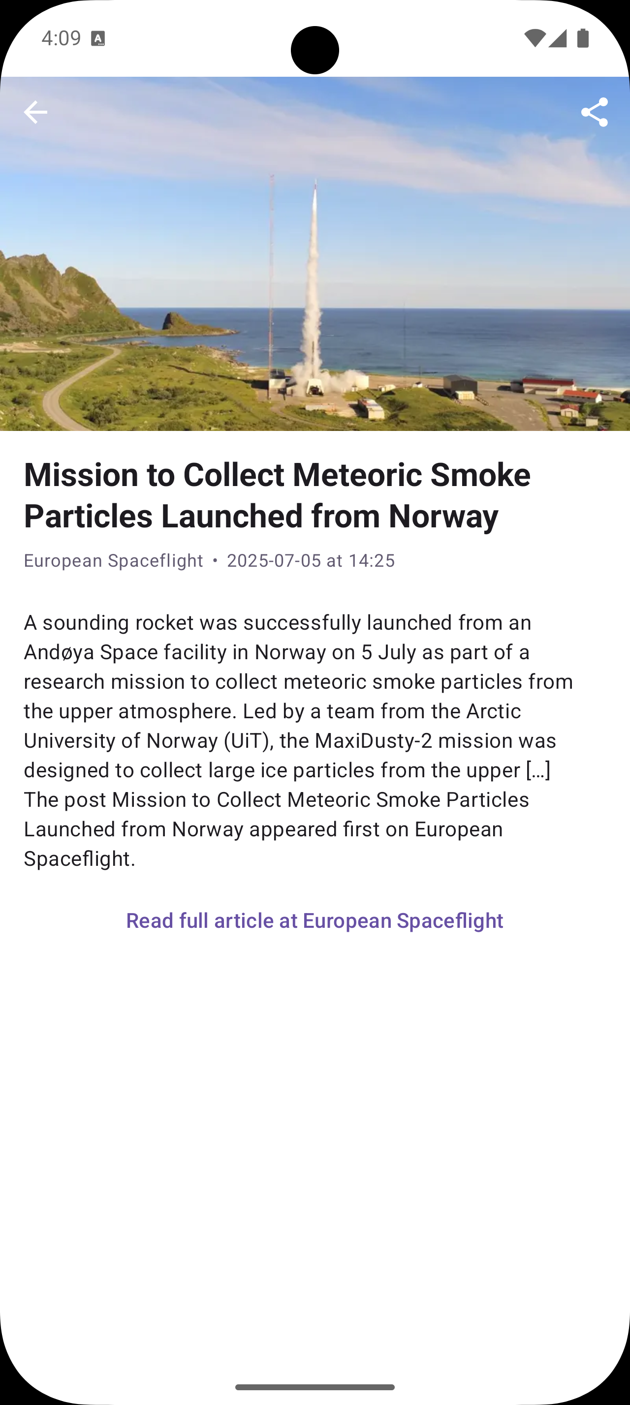
After the change, we can see that the details screen now takes the entire available space and looks much better.
 Updated details screen on iOS.
This is how the details screen looks on all platforms.
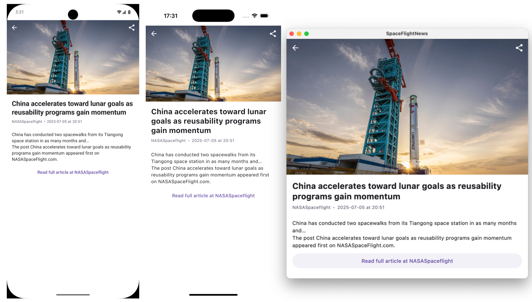 The new details screen on all three platforms: Android, iOS, and desktop.
4. Conclusion
If you followed along to the end, great job! This is the end of the fourth part in the series on Kotlin Multiplatform and Compose Multiplatform. We’ve taken a look at how to use the Compose Navigation library to navigate to a new details screen.
In the next part of the series, we are going to:
- Add a system share functionality to share links to articles with different apps.
- Show how to open the article URL in a web browser.
Stay tuned!
You can find the source code for this part here: https://github.com/landomen/KMPSpaceFlightNews/tree/part-4
To get notified of when the next part is out, please consider following me and subscribing to the email notifications.