Building a Space Flight News App with Compose Multiplatform for Android, iOS, and Desktop: Part 1 — Getting Started with KMP
The first part of a series of articles focusing on building a Compose Multiplatform app. for Android, iOS, and Desktop that displays the latest Space News.
This is the first part of a series of articles focusing on Compose Multiplatform. Over the next few parts, we’ll be building an app for Android, iOS, and Desktop that displays the latest Space Flight news.
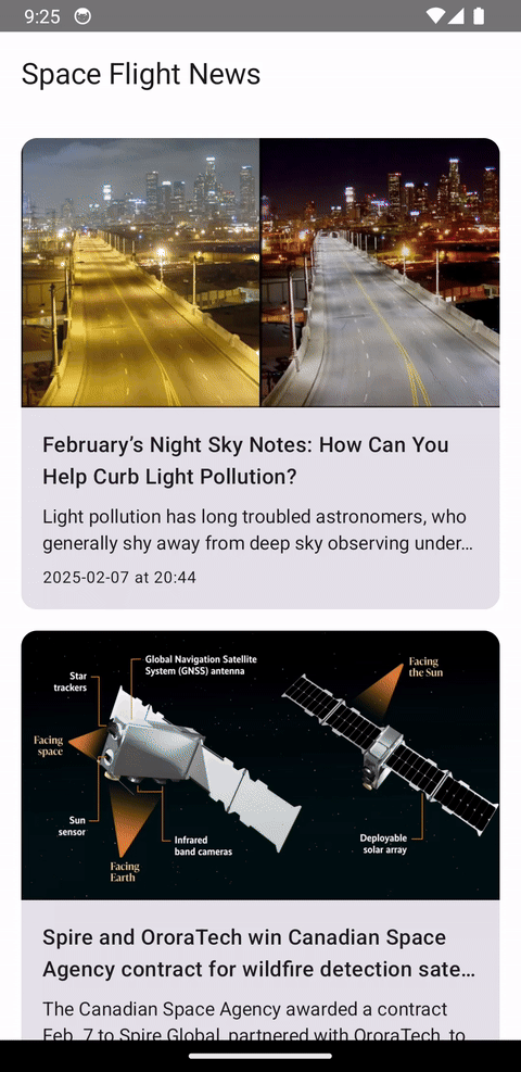
 Screenshot showing the home screen of the final app.
As an Android developer, the idea of being able to write “Android” code and also have it run on iOS, Desktop, and Web almost sounds too good. But JetBrains is promising exactly that with Compose Multiplatform, a “declarative framework for sharing UIs across multiple platforms, based on Kotlin Multiplatform and Jetpack Compose”.
This article will give an overview of the framework and setting up the project, while next parts will focus on:
- building UI with Compose and Material3,
- sharing view models across platforms,
- navigating between screens using Navigation Compose,
- adding dependency injection using Koin,
- integrating a network layer using Ktor,
- integrating a database layer using SQLDelight to support offline mode,
- displaying remote images using Coil,
- opening an URL in an external web browser,
- and opening the system share sheet.
The project we’ll be building
A simple app that displays a list of Space Flight-related news, from newest to oldest. Users can scroll through the list and click on the news to open its details.
The news is fetched from the https://spaceflightnewsapi.net/ API and cached locally on the device to support offline mode.
Users can then read the full article in an external web browser and share the article through a native share sheet.
You can see the final product in the video below. However, in this part, we are going to start with the basics.
 Showcase of the final app.
Requirements
- Have an Android development environment set up. This includes Android Studio, Android SDK, emulator, or physical device.
- Have basic knowledge of Android development and Jetpack Compose.
- If you also wish to run the iOS app, you need a Mac and Xcode. No previous knowledge of iOS development is needed.
Creating a new Compose Multiplatform project
Use the Kotlin Multiplatform Wizard to generate a new project KMP project. Enter desired project name (“SpaceFlightNews” for example), your project ID and check Android, iOS and Desktop. Make sure that “Share UI” is selected for iOS to be able to leverage Compose Multiplatform.
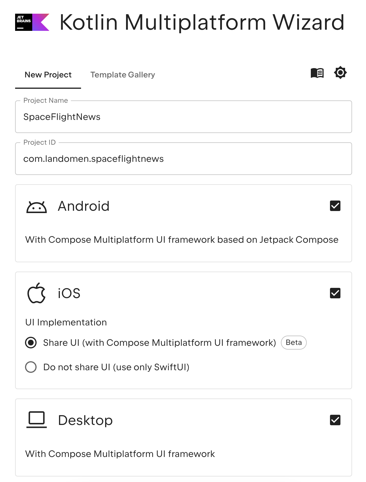 Generating a new starter project using the Kotlin Multiplatform Wizard.
Leave the Web and Server options unchecked and click “Download” to download the starter project.
Next, unzip the downloaded archive and open the project in Android Studio through File -> Open -> Select folder. Make sure to select the entire KMP project folder and hit “Open”.
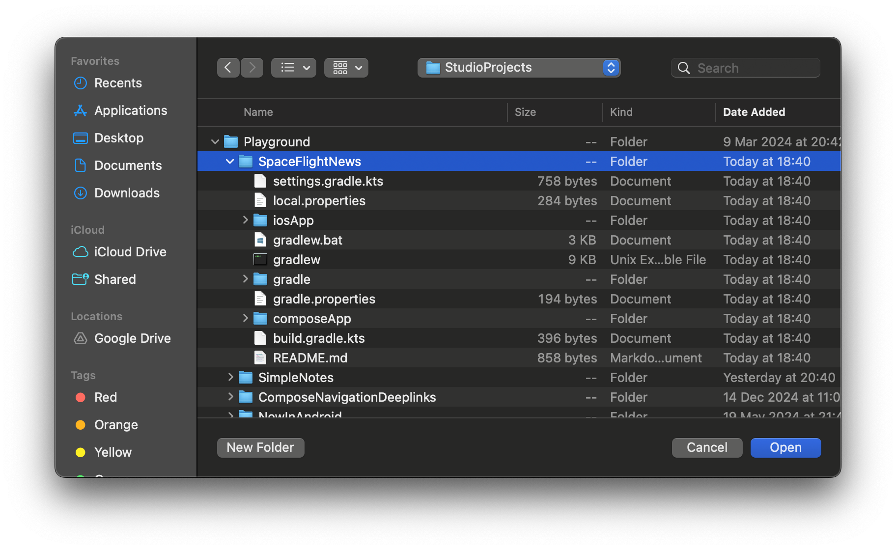 Selecting the entire KMP project folder in Android Studio.
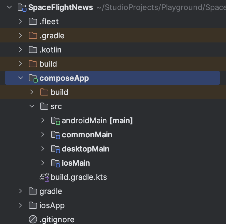
The project should now be opened in Android Studio. Make sure to switch the sidebar project view from Android to Project to see the typical KMP structure.
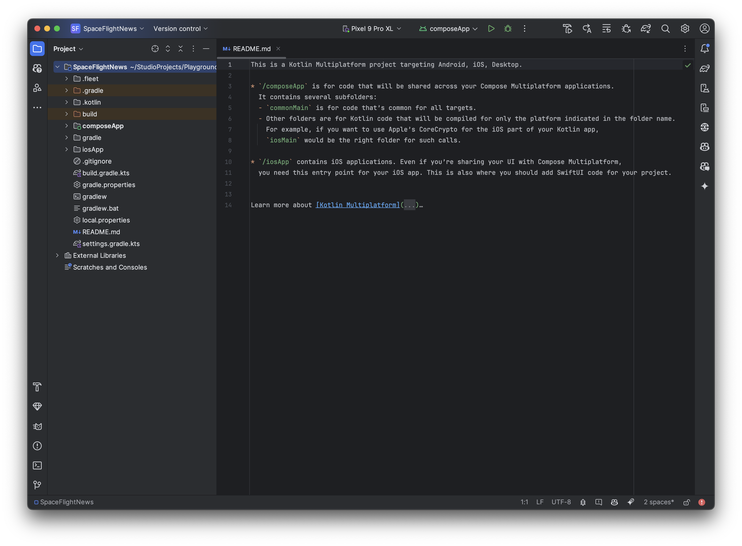 Opened project with the side bar view in Project mode.
Running the app on different platforms
We’ll explore the structure a bit later, but first, let’s try to run the app on different platforms.
Running the Android app
To run the Android app, make sure that you have an emulator running or a physical device connected and that “composeApp” is selected in the run menu. Then, press the green run button to build and deploy the Android app.
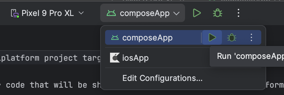 Run configuration selection.
If you have the IDE set up correctly, the app should be built and installed successfully. Once deployed, you will see an empty screen with a single button. Pressing it will display an image and write the platform name and version, in this case, “Android” and “35” (API level).
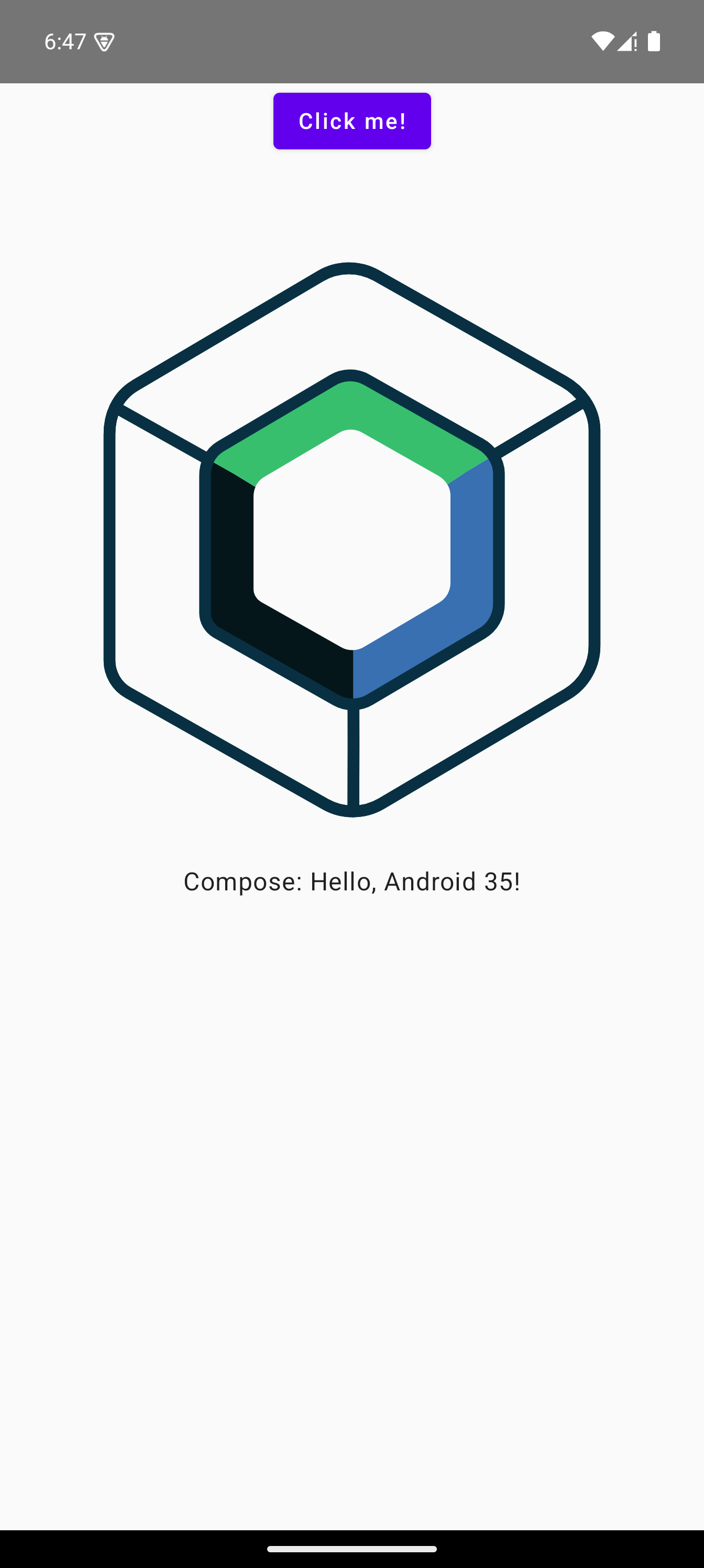 Sample app running on Android.
Running the iOS app
Note: This part requires a Mac OS with Xcode installed and set up. You can not build an iOS app on Windows or Linux even when developing a KMP app.
To run the iOS app, ensure that you have Xcode installed on your Mac OS, have downloaded the iOS SDK, and set up the simulator and command-line tools. All of this should be required when installing Xcode for the first time.
Through Android Studio
The simplest way to run the iOS app is to run it directly from Android Studio. Change the run configuration in the toolbar to “iosApp” and hit the run button.
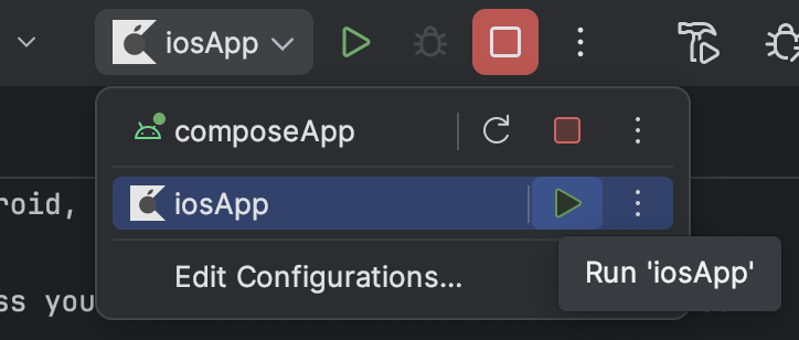 Run configuration selection.
This will use the command line to trigger a build of the iOS app using Xcode, like so:
1
/Applications/Xcode.app/Contents/Developer/usr/bin/xcodebuild -project /path_to_project/SpaceFlightNews/iosApp/iosApp.xcodeproj -scheme iosApp -configuration Debug OBJROOT=/path_to_project/SpaceFlightNews/build/ios SYMROOT=/path_to_project/SpaceFlightNews/build/ios -destination id=SOME-ID -allowProvisioningDeviceRegistration -allowProvisioningUpdates
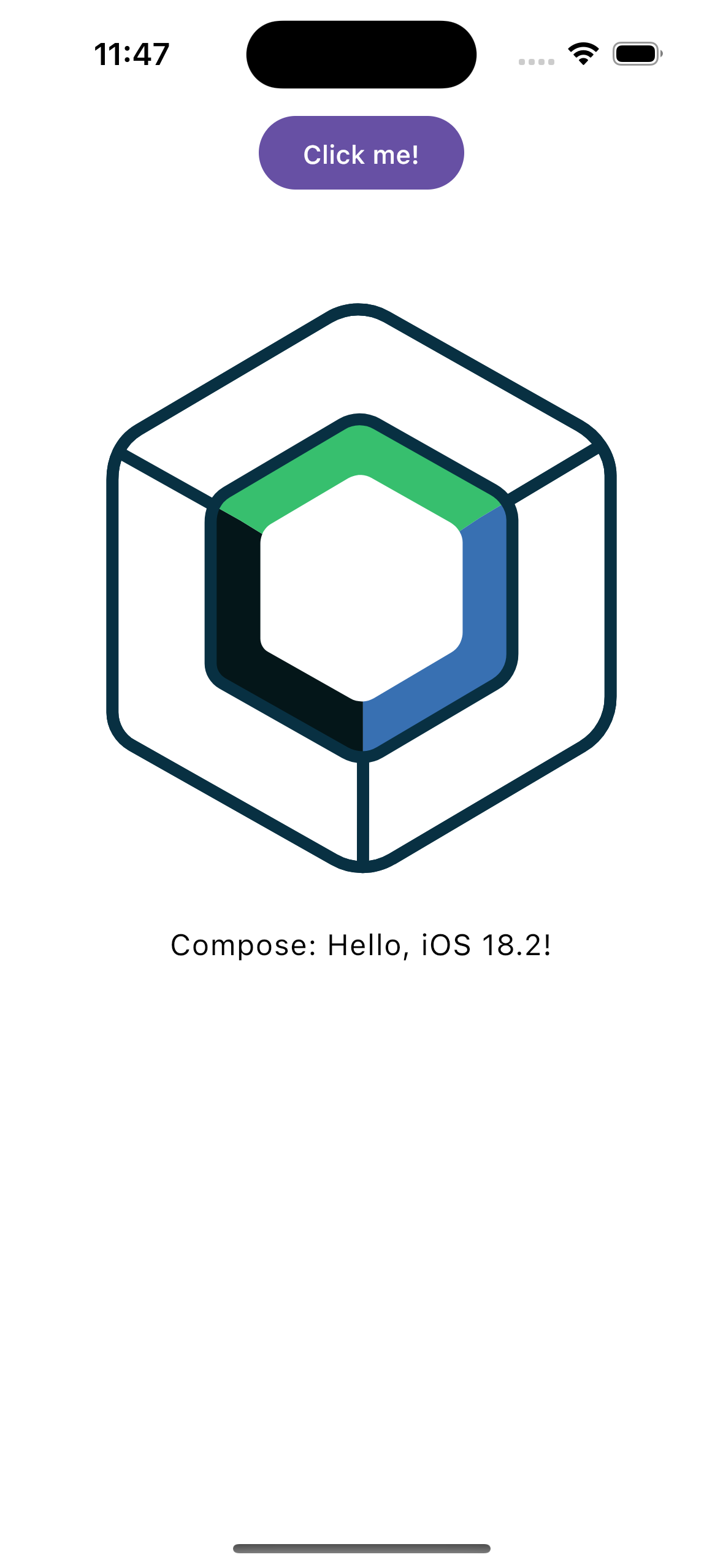
If everything is working okay, your default iOS simulator should start up, and the app should be launched. If the build fails, double-check your Xcode configuration and make sure that everything is correctly installed, and you can launch an iOS simulator without issues.
After pressing the button, you should see “iOS” and OS version (“18.2”).
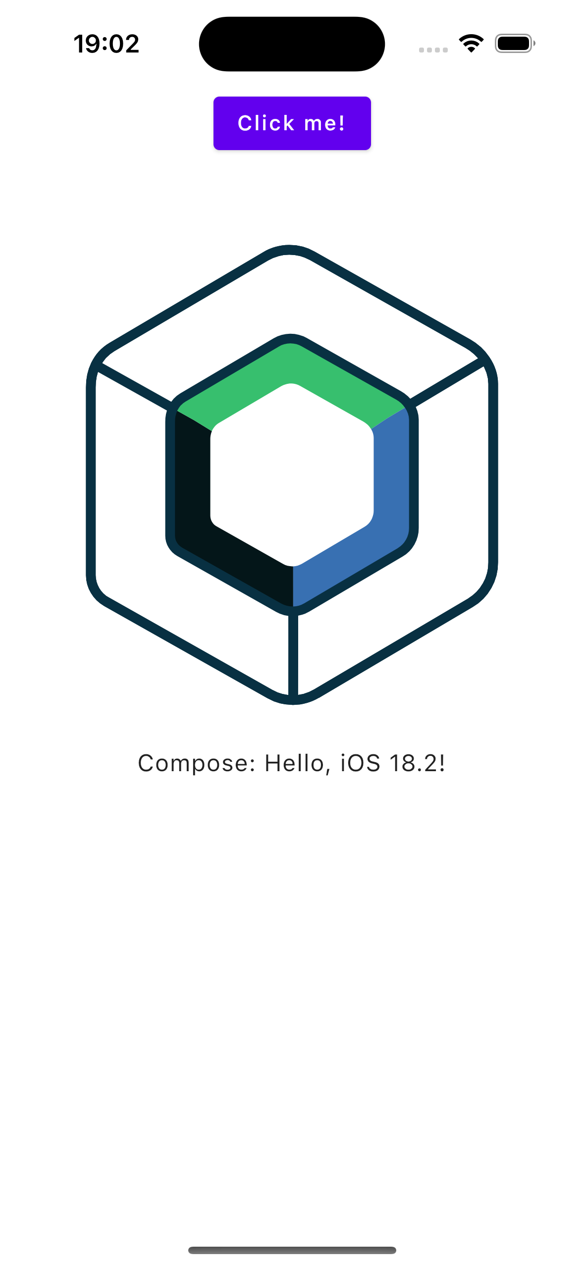 Sample app running on iOS.
With Xcode
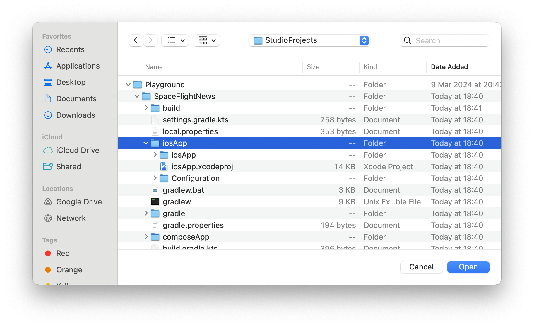
It’s also possible to run the iOS app with Xcode by opening the project in Xcode. To do that, open Xcode and choose either “Open Existing Project…” if you don’t currently have a project opened or File -> Open if you do.
Then, navigate to the project folder and select the entire “iosApp” folder. Make sure that you select the root “iosApp” folder and not the nested one. Click Open, and if asked, select to trust the project.
 Opening the iosApp project in Xcode.
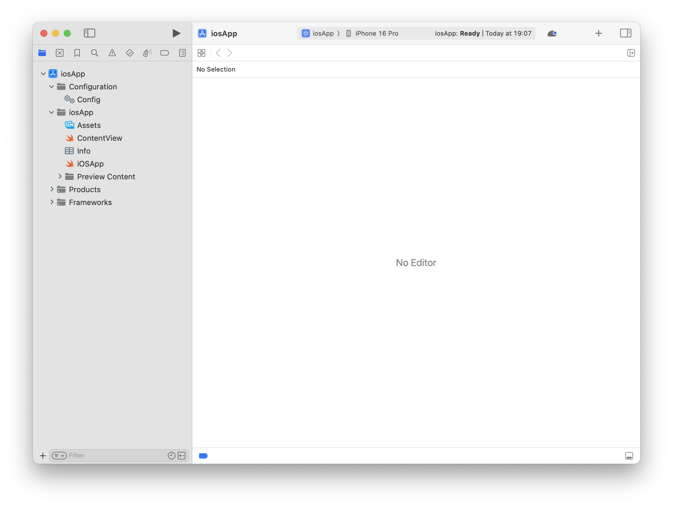
You should now see the whole iOS app project in Xcode. To run it, simply click the big run/arrow button at the top, and the app should be deployed.
 Opening the iosApp project in Xcode.
You will also need to use Xcode if you want to write iOS-specific code or SwiftUI views.
Running the Desktop app
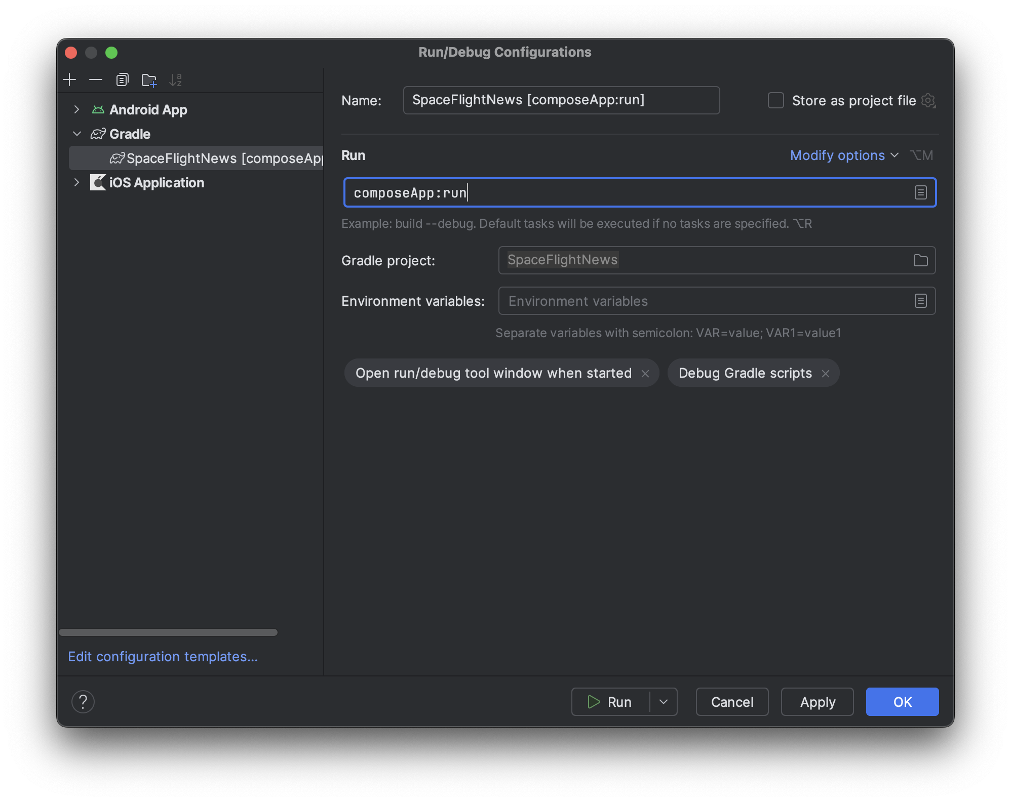
And last but not least, we need to try out the desktop app. First, we need to set up the run configuration. You can click Run -> Edit Configurations in the menu or click “composeApp” or “iosApp” next to the run button in the toolbar and then “Edit Configurations”.
In the window that opens up, click the plus button and select Gradle from the list. Then, write composeApp:run in the “Tasks and arguments” input field. Hit OK and run the app.
 Creating a run configuration for the desktop app.
Gradle will start building the app and shortly a new app will open showing the same UI as the Android and iOS apps. The only difference is that the platform is Java, and the version equals the Java SDK version (21).
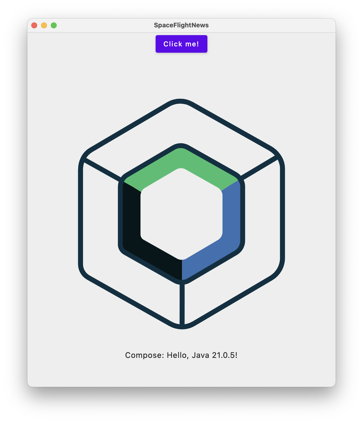 Sample app running on desktop (Mac).
Project structure and code exploration
We’ve successfully ran the app on all three platforms, now let’s check the project structure and code to understand how everything works underneath.
You can find a more detailed description of the project structure on the JetBrains official website, including graphics on how the modules are related.
Exploring the project modules, we can see there are two main modules:
composeAppis the main Kotlin module that contains the shared code.iosAppis an Xcode project for building the iOS app. It uses the code from thecomposeAppmodule to compile into an iOS app.
 Project structure in Android Studio.
The composeApp module is then split into four source sets:
androidMaincontains the Android-specific code that is needed to build the Android app. This includes theAndroidManifest, activities and so on.commonMaincontains the shared code that is used for all platforms, including Composable functions and models. You should write as much code as possible in this module to avoid duplication on platforms.desktopMaincontains the desktop-specific code that is needed to build the Mac/Windows/Linux JVM app.iosMaincontains the iOS-specific code that is needed to build the iOS app. This includes view controllers and so on.
Exploring the code
Next, let’s take a look at the files in our project. In the composeApp module, we find a single build.gradle.kts file that tells Gradle how to build the app. It’s also where we declare the common dependencies for all platforms (inside the commonMain.dependencies{} block) and platform-specific dependencies.
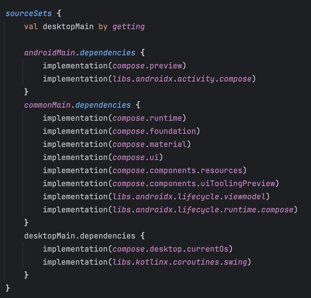 Dependency declaration in the composeApp/build.gradle.kts file.
commonMain source set
There are three files in the commonMain source set within the composeApp module: App.kt, Greeting and Platform.kt.
The App.kt file contains a single composable function App() that draws the UI we saw before using Compose. If you’ve used Jetpack Compose before on Android, this will all look familiar. It creates an instance of the Greeting class.
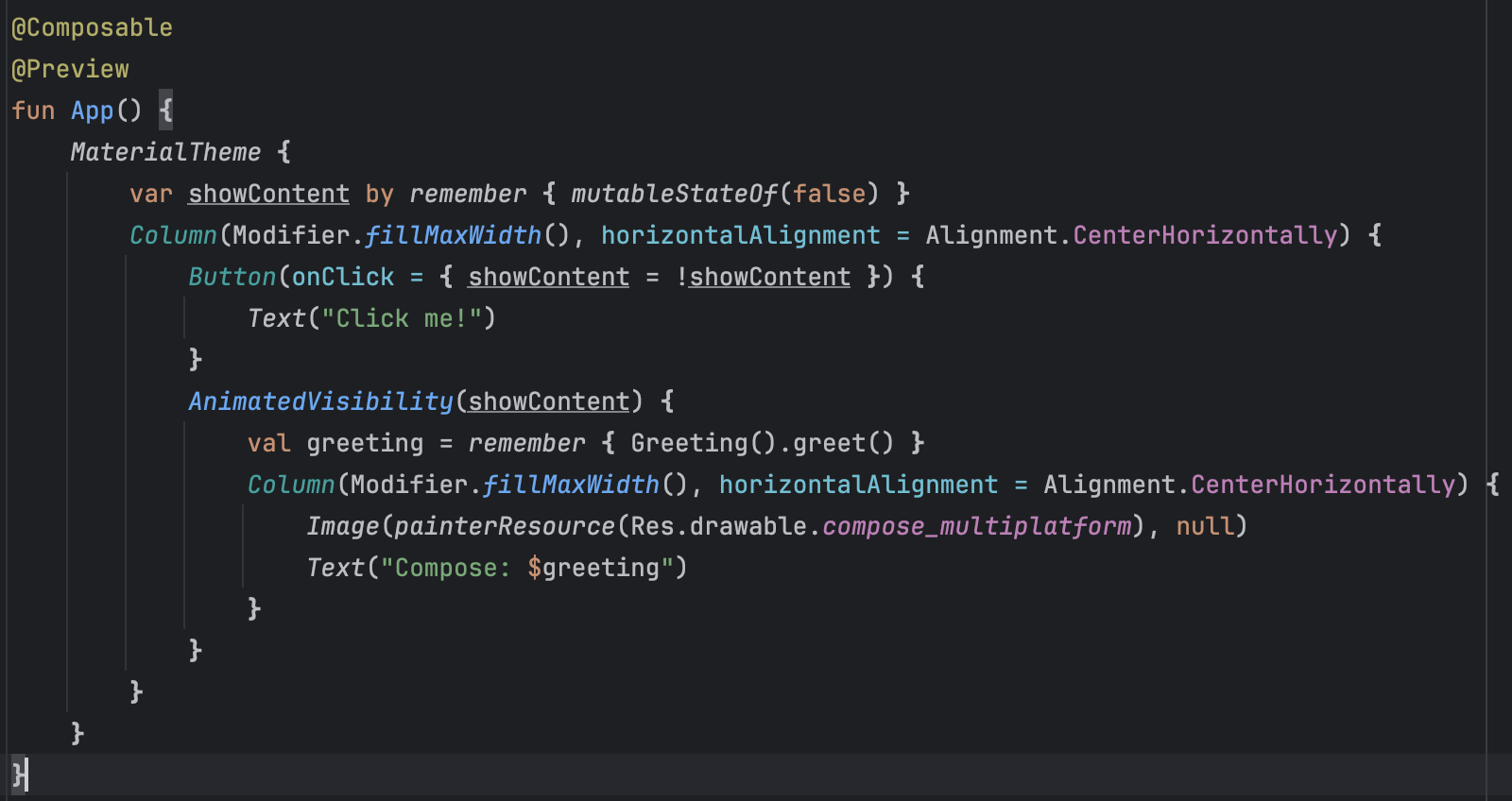 Composable function rendering the app UI.
The Greeting class is a simple Kotlin class that has a single function greet(): String that returns a message. It calls the getPlatform() function to get an instance of the Platform interface declared in the Platform.kt file.
The getPlatform() function is an expected function. An expected function is declared using the expect keyword and is just a declaration of the function. The actual implementation of the function is done for each platform. Next to the function, we can see an orange square with an “A” in the middle (“A” for actual). Clicking on it reveals a list of all the implementations of this function in iosMain, desktopMain and main/androidMain.
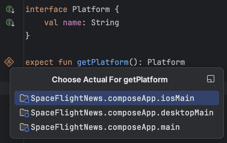 Declaration of an expected function and a list of its implementations.
androidMain source set
Android-specific source set contains a few files worth noting: MainActivity.kt, Platform.android.kt and AndroidManifest.xml. Additionally, there are resource files for launcher icons and strings, but we’ll skip over those.
MainActivity.kt is the entry point into the Android app and simply sets the content of the activity to be the App() composable function we saw earlier in commonMain source set. It also contains a preview composable function to visualize the UI.
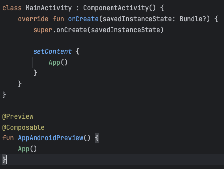 Contents of the MainActivity.kt file.
Platform.android.kt contains the actual declaration of the getPlatform() expected function we saw in the commonMain source sets’ Greeting file. As mentioned before, expected and actual functions allow us to implement platform-specific logic by accessing native APIs. In this case, this is the Android OS SDK version.
Next to the function, there is an orange square with an “E” in the middle (“E” for expect), and clicking it will jump to the expected declaration.
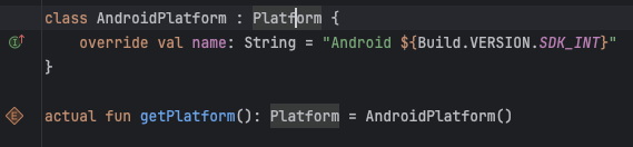 Contents of the Platform.android.kt file with the implementation of the getPlatform() function.
AndroidManifest.xml contains the metadata of the Android application, including its name, icon, theme, and default activity.
desktopMain source set
Desktop-specific source set containing code to run the desktop JVM app on Windows, Mac, and Linux operating systems. It contains two files: main.kt and Platform.jvm.kt.
The main.kt file is the entry point into the app and has a runnable main() function. It creates a Compose application entry point using the application() function and then creates a new Window that draws the App() composable function.
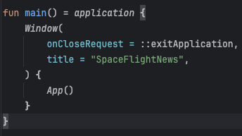 Contents of the main.kt file.
The Platform.jvm.kt file contains the actual implementation of the getPlatform() function, similar to what we saw in the Android-specific file. In this case, it prints the Java version used on the operating system.
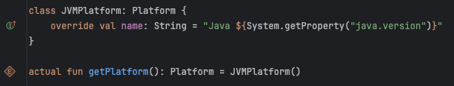 Contents of the Platform.jvm.kt file.
iosMain source set
iOS-specific source set containing two files: MainViewController.kt and Platform.ios.kt.
The MainViewController.kt is the entry point into the iOS app. It creates a new Compose-based UIViewController and renders the App() composable function. A [UIViewController](https://developer.apple.com/documentation/uikit/uiviewcontroller) on iOS is an object that manages the view hierarchy, similar to an Activity or Fragment on Android.
 Contents of the MainViewController.kt file.
The Platform.ios.kt file contains the actual implementation of the getPlatform() function, similar to what we saw in the Android-specific and the Desktop-specific file. In this case, it prints the name of the current device and the system version, which are both iOS-only APIs.
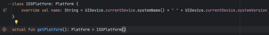 Contents of the Platform.ios.kt file.
Building our app
So far, we’ve taken a look at how a typical KMP project is structured and ran the apps. Now comes the fun part: implementing our Space Flight news app. The end goal is to fetch a list of articles from an API and display them in the app.
Adding a new SpaceFlightArticle model
We need a way to represent an individual space flight article. Taking a look at the SpaceFlightNews API, we can see what the response JSON looks like. We need to create a Kotlin class representing this to map the API response to our local model.
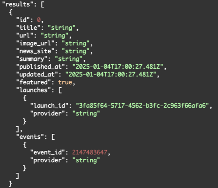 The response model of the SpaceFlightNews API.
Create a new Kotlin data class inside the /composeApp/commonMain source set and name it Article. Then, declare the following fields from the JSON: title, url, image_url, news_site, summary, published_at and updated_at. We’ll omit a few fields we don’t need to render the UI. The result should look something like this:
1
2
3
4
5
6
7
8
9
10
data class Article(
    val id: Long,
    val title: String,
    val url: String,
    val imageUrl: String,
    val newsSite: String,
    val summary: String,
    val publishedAt: String,
    val updatedAt: String,
)
Adding a new dependency
We’ve declared the published and updated timestamps as strings since that’s what we get in the response (2025-01-04T02:04:26Z). However, at some point, we’ll want to render them in a more human-readable way. To do that, we have to represent them as a date/time object. The easiest way is to use the kotlinx-datetime library, so let’s add it.
First, let’s declare the version and dependency in the Gradle Version Catalog file. Open the gradle/libs.versions.toml file and add the following definitions to the versions and libraries sections. Using a version catalog makes it easier to manage dependencies since they are all declared in one place. Perform a gradle sync to generate references the new dependency.
1
2
3
4
5
6
7
[versions]
...
kotlinx-datetime = "0.6.1"

[libraries]
...
kotlinx-datetime = { module = "org.jetbrains.kotlinx:kotlinx-datetime", version.ref = "kotlinx-datetime" }
Next, we have to actually use the dependency. Open the composeApp/build.gradle.kts file and add the following line inside the commonMain.dependencies {} block:
1
implementation(libs.kotlinx.datetime)
Run the gradle sync again and then go back to the Article class we created earlier. Update the publishedAt and updatedAt properties to be of type Instant instead of String. This will later allow us to parse the string timestamp from the response ("2025-01-04T02:04:26Z”) and convert it to an Instant.
1
2
3
4
5
6
7
8
9
10
11
12
import kotlinx.datetime.Instant

data class Article(
    val id: Long,
    val title: String,
    val url: String,
    val imageUrl: String,
    val newsSite: String,
    val summary: String,
    val publishedAt: Instant,
    val updatedAt: Instant,
)
Creating the article list screen
Since we’re building a news app, the main screen will show a list of articles. For now, we’re going to build the UI with mocked data.
Switching to Material3
The UI is currently built on top of the Material 2 design. However, Google’s official recommendation is to use Material 3 for all new apps. We are going to migrate our app to use Material 3 before we start building our UI.
Open the composeApp/build.gradle.kts file and find the following line inside the commonMain.dependencies {} block:
1
implementation(compose.material)
Then simply replace it with this one:
1
implementation(compose.material3)
Perform a gradle sync to apply the changes. If we try to run the app, we’ll notice that the build fails because of errors in the App file. This is because our app is importing the Material2 versions of Button and Text components, and not the Material3 versions. To fix this, open the App.kt file and replace the following imports:
1
2
3
import androidx.compose.material.Button
import androidx.compose.material.MaterialTheme
import androidx.compose.material.Text
with their Material3 equivalents:
1
2
3
import androidx.compose.material3.Button
import androidx.compose.material3.MaterialTheme
import androidx.compose.material3.Text
And that’s it! If we run the app now, we will see that the button is in the Material3 style.
 Sample app using Material 3 design system, running on iOS.
Removing old sample code
Since we’re going to be building our own UI, let’s delete the old sample code from the wizard. It served its purpose of allowing us to examine the structure of a KMP app and how expect/actual declarations work.
Start by going to the composeApp/commonMain/App.kt and delete everything inside the MaterialTheme {} block and remove all unused imports. You should be left with this:
1
2
3
4
5
6
7
@Composable
@Preview
fun App() {
    MaterialTheme {

    }
}
Next, let’s delete the composeApp/commonMain/Greeting and the composeApp/commonMain/Platform.kt files. Make sure to also delete the composeApp/androidMain/Platform.android.kt, composeApp/desktopMain/Platform.jvm.kt and composeApp/iOS/Platform.ios.kt files.
Finally, delete the composeApp/commonMain/composeResources/compose-multiplatform.xml file that displayed the Compose Multiplatform logo in the app.
Running the app should still work. You will just see an empty screen. We now have a blank slate to add our own code.
Creating a scaffold
Let’s create the UI structure for our app. To do that, we’ll use a Scaffold, which allows us to construct a typical Compose screen.
1
2
3
4
5
6
7
8
9
@Composable
@Preview
fun App() {
    MaterialTheme {
        Scaffold { innerPadding ->
            // TODO Add content
        }
    }
}
We want to have a top bar with the name of the app at the top that will also later serve as a way to navigate back from the article details screen. To do that, we can provide a TopAppBar composable to the topBar argument of the Scaffold component. The TopAppBar composable expects a single title composable, which is typically a Text component.
Because many of the Material3 components are still considered experimental, we have to apply the
@OptIn(ExperimentalMaterial3Api::class)annotation to our composable functions.
1
2
3
4
5
6
7
8
9
10
11
12
13
14
15
16
17
18
@OptIn(ExperimentalMaterial3Api::class)
@Composable
@Preview
fun App() {
    MaterialTheme {
        Scaffold(
            topBar = {
                TopAppBar(
                    title = {
                        Text(text = "Space Flight News")
                    }
                )
            }
        ) { innerPadding ->
            // TODO
        }
    }
}
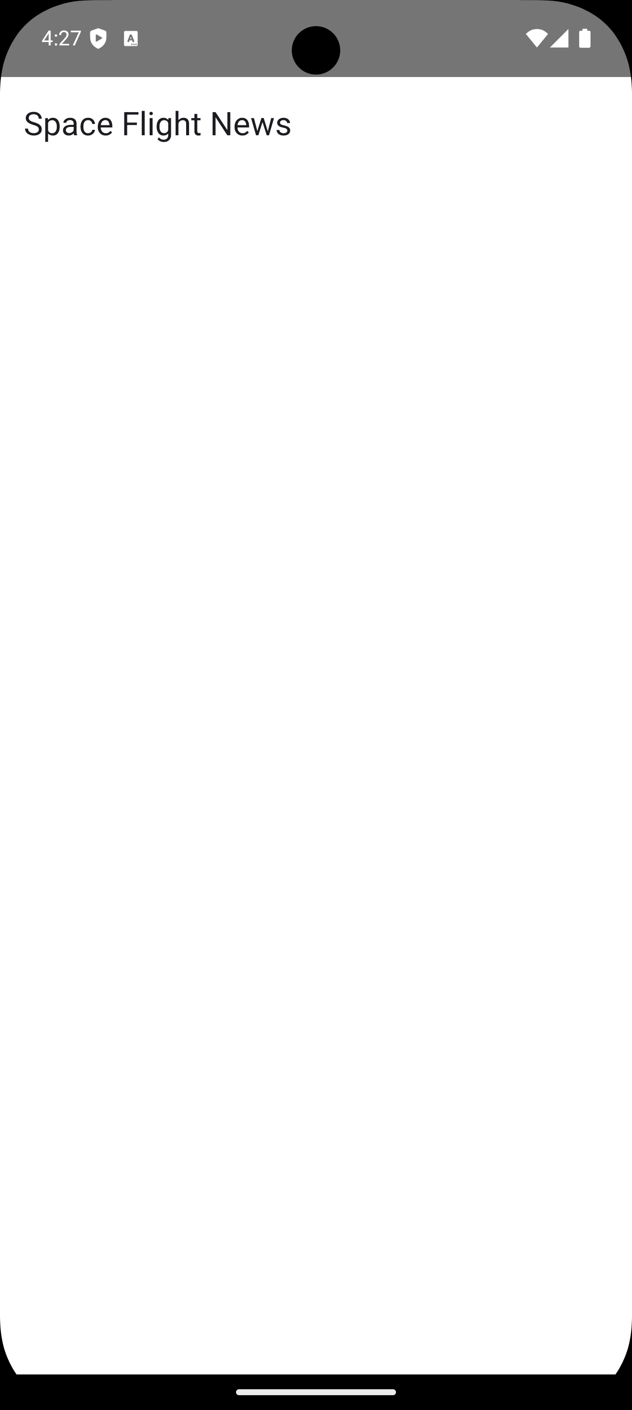
If we run the app, we see that we now display the app title at the top of the screen.
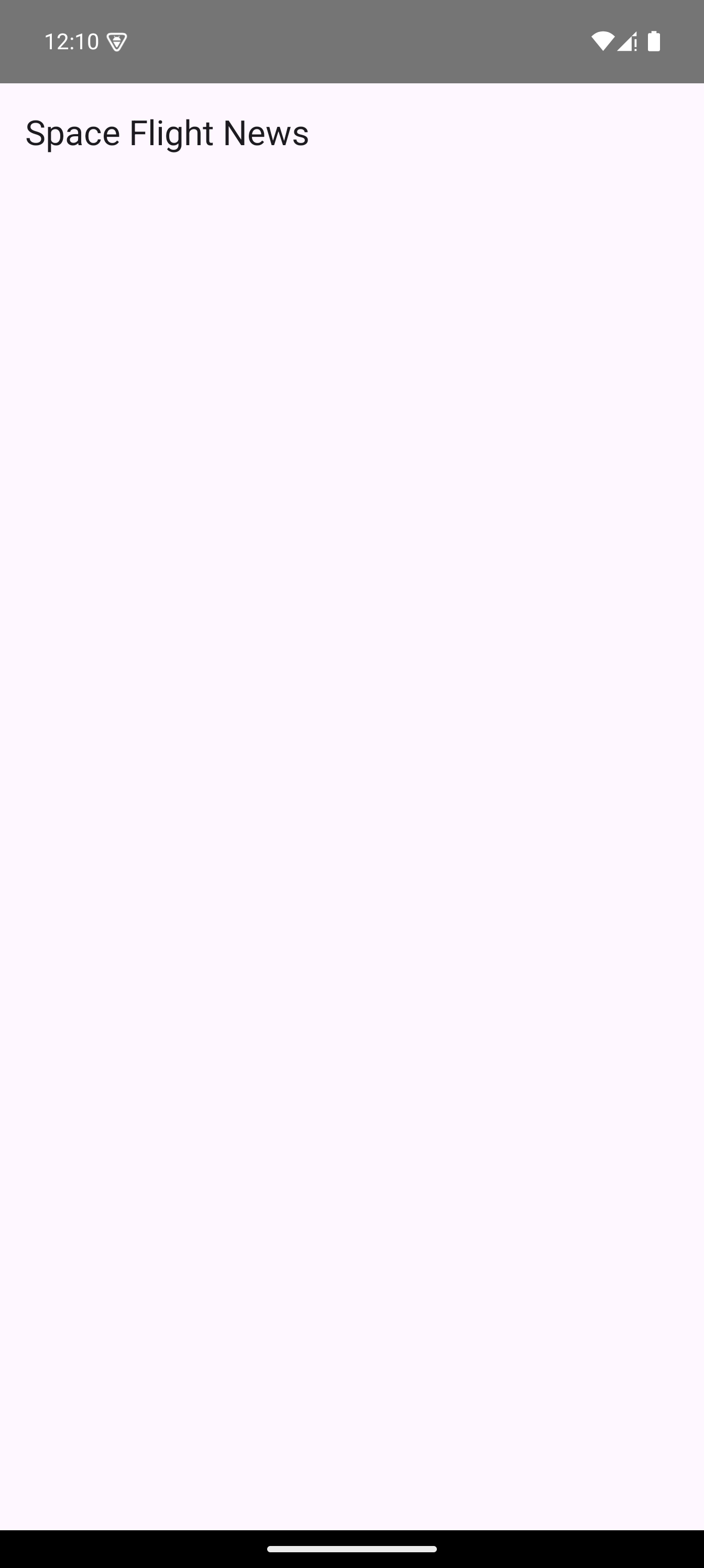 Empty scaffold with top bar.
Adding a new app theme
This is great, but you’ll notice that our background is a shade of pink and no longer white as before. That is because we are using the default MaterialTheme theme and Scaffold uses the MaterialTheme.colorScheme.background color for its containerColor property.
We could fix this by setting the Scaffold.containerColor to Color.White. However, while that would fix the background color for this specific screen, we would need to do this everytime we use a Scaffold or any composable that references the MaterialTheme.colorScheme.background color. Additionaly, the background would remain white even when dark theme is enabled.
Instead, to address this properly, let’s create a new AppTheme that we will use in our app instead of the default MaterialTheme. Create a new file Theme.kt inside the spaceflightnews/ui/theme package and add a new AppTheme composable function:
1
2
3
4
5
6
7
8
9
10
11
12
13
14
15
16
17
18
19
private val LightColorScheme = lightColorScheme(
    background = Color.White,
    surface = Color.White,
)

private val DarkColorScheme = darkColorScheme()

@Composable
fun AppTheme(
    darkTheme: Boolean = isSystemInDarkTheme(),
    content: @Composable() () -> Unit
) {
    val colorScheme = if (darkTheme) DarkColorScheme else LightColorScheme

    MaterialTheme(
        colorScheme = colorScheme,
        content = content
    )
}
We’ve first defined our own colors for the light color scheme and kept the default dark color scheme. Next, we pass those schemes to the default MaterialTheme. To use the new theme, we simply replace the MaterialTheme wrapper in the App file with AppTheme:
1
2
3
4
5
6
7
8
9
10
11
12
13
14
15
16
17
18
@OptIn(ExperimentalMaterial3Api::class)
@Composable
@Preview
fun App() {
    AppTheme {
        Scaffold(
            topBar = {
                TopAppBar(
                    title = {
                        Text(text = "Space Flight News")
                    }
                )
            }
        ) { innerPadding ->
            // TODO
        }
    }
}
If we run the app now, we see a white background. And switching to dark mode on the device correctly renders a black background.
 Empty scaffold with correct background.
Using string resources
You’ll notice we hardcoded the title of the app in the top bar, which is not a good practice. Resources like images and strings are usually placed in the composeResources folder and referenced in the code. This approach is similar to how we declare resources on Android and enables good localization support.
Create a new values folder inside the composeApp/commonMain/composeResources folder. Then, create a new file named strings.xml inside the new folder. Declare the app name like so:
Empty scaffold with correct background.
1
2
3
<resources>
    <string name="app_name">Space Flight News</string>
</resources>
To be able to reference the newly added string from the code, we have to rebuild or re-run our project. This allows KMP to generate a static accessor for it. Now, we can go back to our TopAppBar composable in the App file and replace the hard-coded string with stringResource(Res.string.app_name). We also need to import the Res and app_name references.
You can find more information on how to use multiplatform resources here.
Defining a new article list screen
We’ve created our scaffold; now it’s time to create the landing screen that will show a list of articles. Let’s start by creating a new folder named ui next to the existing App.kt file that will contain all our UI-related code. Then, create a new file named ArticleListScreen.kt inside it. It’s good practice to extract screen-level code to new files and not have a single large App file.
Next, we’re going to define a new Composable function named ArticleListContent() inside the ArticleListScreen.kt that will be responsible for rendering a list of articles it receives.
1
2
3
4
5
6
@Composable
private fun ArticleListContent(
    articles: List<Article>,
){
    // TODO
}
A scrollable list of items in Compose is typically represented with a LazyColumn component that is optimized to only layout the items that are visible on screen. We are going to use it to show our list of articles.
1
2
3
4
5
6
7
8
9
10
11
12
13
14
@Composable
private fun ArticleListContent(
    articles: List<Article>,
){
    LazyColumn(
        contentPadding = PaddingValues(16.dp),
        verticalArrangement = Arrangement.spacedBy(16.dp),
        modifier = Modifier.fillMaxSize()
    ) {
        items(articles) { article ->
            // TODO
        }
    }
}
Next, we need a Composable to draw an individual article. Let’s create a new composable function ArticleItem() that accepts a single article and renders a Card with the article title, summary, and publication date.
We are using a Column to vertically position the texts, with a 8.dp spacing between them.
The publication date requires a bit of manual formatting to display it in a human-readable format. If you remember, we’ve represented the date as an Instant, which will print the date in the following format: “2023–01–02T23:40:57.120Z”. To format it as yyyy-MM-dd at HH:mm we have to first convert it to a LocalDateTime using the device timezone, then build our datetime pattern.
1
2
3
4
5
6
7
8
9
10
11
12
13
14
15
16
17
18
19
20
21
22
23
24
25
26
27
28
29
30
31
32
33
34
35
36
37
38
39
40
41
42
43
44
45
@Composable
private fun ArticleItem(
    article: Article,
) {
    Card(
        modifier = Modifier.fillMaxWidth()
    ) {
        Column(
            verticalArrangement = Arrangement.spacedBy(8.dp),
            modifier = Modifier.fillMaxSize().padding(16.dp)
        ) {
            Text(
                text = article.title,
                style = MaterialTheme.typography.titleMedium,
                maxLines = 2,
                overflow = TextOverflow.Ellipsis,
            )

            Text(
                text = article.summary,
                style = MaterialTheme.typography.bodyMedium,
                maxLines = 2,
                overflow = TextOverflow.Ellipsis
            )

            Text(
                text = article.publishedAt.toLocalDateTime(TimeZone.currentSystemDefault()).format(
                    LocalDateTime.Format {
                        year()
                        char('-')
                        monthNumber()
                        char('-')
                        dayOfMonth()

                        chars(" at ")

                        hour()
                        char(':')
                        minute()
                    }),
                style = MaterialTheme.typography.bodySmall,
            )
        }
    }
}
Now that we have our article composable, we can go back to the ArticleListContent composable and add it to the composition.
1
2
3
4
5
6
7
8
9
10
11
12
13
14
15
16
@Composable
private fun ArticleListContent(
    articles: List<Article>,
) {
    LazyColumn(
        contentPadding = PaddingValues(16.dp),
        verticalArrangement = Arrangement.spacedBy(16.dp),
        modifier = Modifier.fillMaxSize()
    ) {
        items(articles) { article ->
            ArticleItem(
                article = article,
            )
        }
    }
}
We have our scrollable list, but we need to use it somewhere. Let’s create a new composable function at the top of the file named ArticleListScreen() and add the ArticleListContent() composable to the composition. There is one issue, though: we need to pass a list of articles to it, which we don’t have.
We’ll integrate fetching articles from a remote service in later parts. For now, we’ll simply hardcode a few articles to be able to run the app and visualize our UI.
1
2
3
4
5
6
7
8
9
10
11
12
13
14
15
16
17
18
19
20
21
22
23
24
25
26
27
28
29
30
31
32
33
34
35
36
37
38
39
40
41
@Composable
internal fun ArticleListScreen() {
    val articles = remember {
        listOf(
            Article(
                id = 28392,
                title = "SpaceX launches UAE’s Thuraya-4 mobile connectivity satellite",
                url = "https://spacenews.com/spacex-launches-uaes-thuraya-4-mobile-connectivity-satellite/",
                imageUrl = "https://i0.wp.com/spacenews.com/wp-content/uploads/2025/01/Thuraya-4-scaled.jpg?fit=1024%2C635&quality=89&ssl=1",
                newsSite = "SpaceNews",
                summary = "SpaceX launched the Thuraya-4 voice and data connectivity satellite Jan. 3 for Space42, the United Arab Emirates’ recently formed AI-powered space technology champion.\r\nThe post SpaceX launches UAE’s Thuraya-4 mobile connectivity satellite appeared first on SpaceNews.",
                publishedAt = Instant.parse("2025-01-04T02:04:26Z"),
                updatedAt = Instant.parse("2025-01-04T08:35:00.677975Z"),
            ),
            Article(
                id = 28391,
                title = "NASA sees strong support for strategy to maintain continuous human presence in LEO",
                url = "https://spacenews.com/nasa-sees-strong-support-for-strategy-to-maintain-continuous-human-presence-in-leo/",
                imageUrl = "https://i0.wp.com/spacenews.com/wp-content/uploads/2024/12/54209298773_f912740933_k.jpg?fit=1024%2C683&quality=89&ssl=1",
                newsSite = "SpaceNews",
                summary = "NASA’s deputy administrator says there is nearly unanimous support for its LEO microgravity strategy that endorses keeping humans in orbit continuously.\nThe post NASA sees strong support for strategy to maintain continuous human presence in LEO appeared first on SpaceNews.",
                publishedAt = Instant.parse("2025-01-03T23:54:59Z"),
                updatedAt = Instant.parse("2025-01-04T00:00:25.390033Z"),
            ),
            Article(
                id = 28390,
                title = "SpaceX achieves record-breaking 2024, looks ahead to 2025",
                url = "https://www.nasaspaceflight.com/2025/01/spacex-roundup-2024/",
                imageUrl = "https://www.nasaspaceflight.com/wp-content/uploads/2025/01/SpaceX-in-2024-collage.png",
                newsSite = "NASASpaceflight",
                summary = "SpaceX is gearing up for another record-breaking year in 2025 after surpassing all previous record-breaking…\nThe post SpaceX achieves record-breaking 2024, looks ahead to 2025 appeared first on NASASpaceFlight.com.",
                publishedAt = Instant.parse("2025-01-03T22:24:00Z"),
                updatedAt = Instant.parse("2025-01-03T23:20:12.779937Z"),
            ),
        )
    }

    ArticleListContent(
        articles = articles,
    )
}
Finally, let’s go back to the App.kt file and add the ArticleListScreen() composable to the Scaffold content. We’re using a Box here to apply innerPadding, which makes sure that the content is not drawn underneath the system or navigation bars.
1
2
3
4
5
6
7
8
9
10
11
12
13
14
15
16
17
18
19
20
@OptIn(ExperimentalMaterial3Api::class)
@Composable
@Preview
fun App() {
    AppTheme {
        Scaffold(
            topBar = {
                TopAppBar(
                    title = {
                        Text(text = stringResource(Res.string.app_name))
                    }
                )
            }
        ) { innerPadding ->
            Box(modifier = Modifier.padding(innerPadding)) {
                ArticleListScreen()
            }
        }
    }
}
And that’s it! Let’s run the app and see the result.
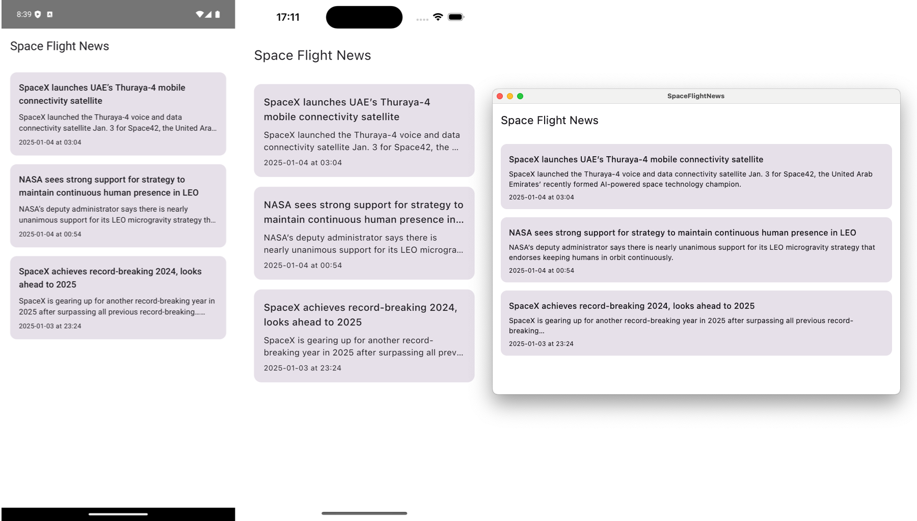 Final app running on Android, iOS, and Desktop.
Bonus challenge
Wouldn’t it be great to add visualization to the app and display a cover image next to each article? It certainly would. The challenge is for you to add loading and displaying of images in the app from an URL.
You can use the Coil image loading library to simplify the process. If you get stuck, feel free to follow this guide that I’ve prepared: Loading Images with Coil in Compose Multiplatform.
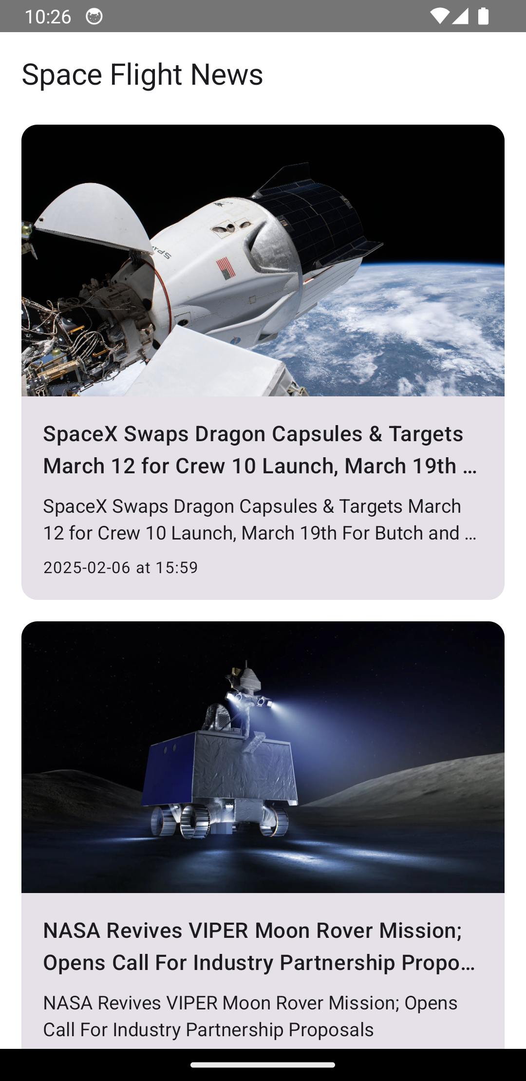 Updated app with cover images for each article.
Conclusion
If you followed all the way to the end, congratulations and thank you! This is the end of the first part of the series on Kotlin Multiplatform and Compose Multiplatform. We’ve built a simple (for now) news app, and during the process, we took a look at how:
- to create a new KMP project with shared UI using Compose Multiplatform,
- to run the app on different platforms,
- the project is structured with shared modules, source sets, and a separate iOS project,
- to enable the Material3 design system and create a custom theme,
- to add new string resources,
- to use the
kotlix-datetimelibrary, - and to build and display a list of items with Compose.
In the next part of the series, we are going to load the most recent news from the API service. To do that, we will add the following to our project:
- a shared ViewModel library to follow MVVM architecture on all platforms,
- Ktor network library to execute network requests using Kotlin coroutines,
- Coil image loading library to load article images from the network,
- and Koin dependency injection framework to tie everything together.
Stay tuned!
You can find the source code here: https://github.com/landomen/KMPSpaceFlightNews
To get notified of when the next part is out, please consider following me.