Tooltips in Compose Material 3
The Material Design 3 library in Compose provides an out-of-the-box API for displaying tooltips in apps.
The Material Design 3 library in Compose provides an out-of-the-box API for displaying tooltips in apps. We’ll examine how to use it in the stable 1.3.2 version and the latest 1.4.0-alpha version.
Note: all of the mentioned composables are currently still in experimental state, meaning that their API could change in the future.
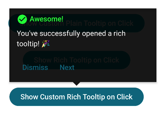 Example of a custom rich tooltip.
Pre-requisites
Before we can use the Tooltip API in Compose, we have to add the Compose Material 3 library to our project.
If we use Compose BOM, then we are using the latest stable version, which at the time of writing this is 1.3.2. If we want to use the latest alpha version, we have to manually specify the version number, which is 1.4.0-alpha13.
The Tooltip API has changed slightly in the 1.4.0-alpha versions, with some additional new features being added. The samples in this article will be based on the 1.3.2 API. However, we will list all the differences in the 1.4.0 version at the end, so you’ll be able to use both.
Types of tooltips
There are two main types of supported tooltips: plain and rich.
Plain tooltips usually display a simple text and are used for notifying the user about certain actions or on-screen elements.
 Simple plain tooltip.
Rich tooltips are bigger and able to display more content. They have a dedicated title and description, along with a custom action that can be used to display buttons to trigger some logic.
 Simple rich tooltip.
Both types of tooltips can be displayed either automatically when user long presses on a compontent or manually from the code. They are dismissed either automatically after 1500 milliseconds, or after the user touches any part of the screen, or manually from the code.
Tooltips can also have an optional caret, which is the arrow at the bottom of the tooltip pointing to the anchor component.
Tooltip API
The main composable is the TooltipBox, which acts as a wrapper around our composable, above which we want to display the tooltip. It contains logic to calculate the position of the tooltip to place it above the content composable.
It accepts the following arguments:
positionProvider: PopupPositionProvider: used to place the tooltip relative to the anchor content,tooltip: @Composable TooltipScope.() -> Unit: the composable that will be used to populate the tooltip’s content,state: TooltipState: controls the state of the tooltip’s visibility,modifier: Modifier: standard composable modifier,focusable: Boolean: determines if the tooltip is focusable, affecting accessibility,enableUserInput: Boolean: determines if thisTooltipBoxwill handle long press and mouse hover to trigger the tooltip through the state provider,content: @Composable () -> Unit: the composable that the tooltip will anchor to. Basically, the content we want to show by default, and above which the tooltip will be displayed when triggered.
1
2
3
4
5
6
7
8
9
10
11
@Composable
@ExperimentalMaterial3Api
fun TooltipBox(
    positionProvider: PopupPositionProvider,
    tooltip: @Composable TooltipScope.() -> Unit,
    state: TooltipState,
    modifier: Modifier = Modifier,
    focusable: Boolean = true,
    enableUserInput: Boolean = true,
    content: @Composable () -> Unit,
)
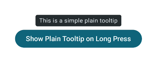
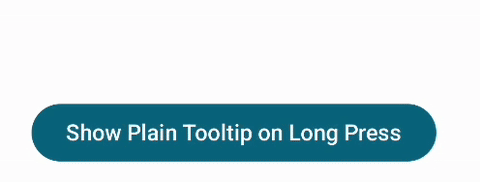
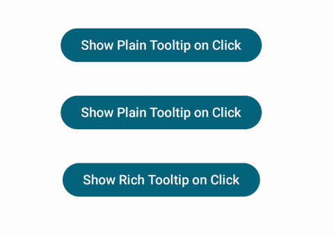
Plain Tooltip
We have a simple button above which we want to display the tooltip. To do that, we wrap our content with TooltipBox:
1
2
3
4
5
6
7
8
9
TooltipBox(
    positionProvider = TooltipDefaults.rememberPlainTooltipPositionProvider(),
    tooltip = { PlainTooltip { Text("This is a simple plain tooltip") } },
    state = rememberTooltipState()
) {
    Button(onClick = {}) {
        Text(text = "Show Plain Tooltip on Long Press")
    }
}
We are using TooltipDefaults.rememberPlainTooltipPositionProvider to let the API handle positioning. The tooltip is created by using the PlainTooltip composable.
1
2
3
4
5
6
7
8
9
10
11
12
@Composable
@ExperimentalMaterial3Api
expect fun TooltipScope.PlainTooltip(
    modifier: Modifier = Modifier,
    caretSize: DpSize = DpSize.Unspecified,
    shape: Shape = TooltipDefaults.plainTooltipContainerShape,
    contentColor: Color = TooltipDefaults.plainTooltipContentColor,
    containerColor: Color = TooltipDefaults.plainTooltipContainerColor,
    tonalElevation: Dp = 0.dp,
    shadowElevation: Dp = 0.dp,
    content: @Composable () -> Unit
)
We can customize the following elements of the tooltip:
caretSize: DpSize: size of the caret (bottom arrow), which is hidden by defaultshape: Shape: shape to apply to the tooltip container, can be used to customize the corners, for examplecontentColor: Color: color of the content (i.e., text) inside the tooltipcontainerColor: Color: color of the tooltip container/background
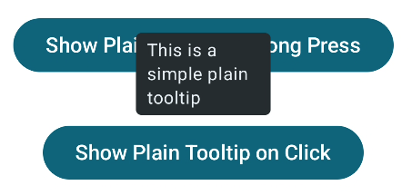
Passing the rememberTooltipState to the TooltipBox means that the tooltip will automatically show up when we long-press on the content. It will also dismiss automatically after a short time.
 Simple tooltip that displays on a long pressing the button.
Rich Tooltip
We want to display a tooltip with a title and description when we click on the button. The tooltip should remain displayed until we either click the dismiss button on the tooltip or anywhere outside of the tooltip.
 Rich tooltip that displays on button click.
We are again using the TooltipBox with two changes to support the Rich Tooltip: we’re passing in a TooltipDefaults.rememberRichTooltipPositionProvider for the positionProvider, and using the RichTooltip composable to create a different style of the tooltip.
1
2
3
4
5
6
7
8
9
10
11
12
13
14
15
16
17
18
19
20
21
22
23
24
25
26
27
28
29
30
31
32
33
val tooltipState = rememberTooltipState(isPersistent = true)
val scope = rememberCoroutineScope()
TooltipBox(
    positionProvider = TooltipDefaults.rememberRichTooltipPositionProvider(8.dp),
    tooltip = {
        RichTooltip(
            caretSize = TooltipDefaults.caretSize,
            title = { Text("Title of the tooltip") },
            action = {
                TextButton(
                    onClick = {
                        scope.launch {
                            tooltipState.dismiss()
                        }
                    }
                ) {
                    Text("Dismiss")
                }
            }
        ) {
            Text("This is the main content of the rich tooltip")
        }
    },
    state = tooltipState
) {
    Button(onClick = {
        scope.launch {
            tooltipState.show()
        }
    }) {
        Text(text = "Show Rich Tooltip on Click")
    }
}
Since we want the tooltip to show up only when we click the button and remain visible until we click somewhere on the screen, we’re creating and saving an instance of the TooltipState and passing in isPersistent = true.
We then use this stored state to call tooltipState.show() to show the tooltip and tooltipState.dismiss() to dismiss it. Note that both are suspending functions, and they need to be called within a coroutine scope.
1
2
3
4
5
6
7
8
9
10
11
12
13
@Composable
@ExperimentalMaterial3Api
expect fun TooltipScope.RichTooltip(
    modifier: Modifier = Modifier,
    title: (@Composable () -> Unit)? = null,
    action: (@Composable () -> Unit)? = null,
    caretSize: DpSize = DpSize.Unspecified,
    shape: Shape = TooltipDefaults.richTooltipContainerShape,
    colors: RichTooltipColors = TooltipDefaults.richTooltipColors(),
    tonalElevation: Dp = ElevationTokens.Level0,
    shadowElevation: Dp = RichTooltipTokens.ContainerElevation,
    text: @Composable () -> Unit
)
The API of the RichTooltip composable function is similar to the PlainTooltip with the main difference that there are three composable functions that we can pass in:
text: @Composable () -> Unit: the mandatory content that represents the main message of the tooltiptitle: (@Composable () -> Unit)?: an optional content for the title of the tooltip, shown above the mandatory messageaction: (@Composable () -> Unit)?: an optional content for an action to display on the tooltip, typically aTextButton
Customizing the tooltips
Both types of tooltips offer a lot of customization. Let’s take a look at how we can use the different parameters to customize the tooltip layout.
The following snippet will create a plain tooltip with a gray background, custom rounded corners, a larger caret, and custom content with yellow yellow-tinted icon and text.
1
2
3
4
5
6
7
8
9
10
11
12
13
14
15
16
17
18
19
20
21
22
23
24
25
26
27
28
29
30
TooltipBox(
    positionProvider = TooltipDefaults.rememberPlainTooltipPositionProvider(16.dp),
    tooltip = {
        PlainTooltip(
            caretSize = DpSize(32.dp, 16.dp),
            contentColor = Color.Yellow,
            containerColor = Color.DarkGray,
            shadowElevation = 4.dp,
            tonalElevation = 12.dp,
            shape = RoundedCornerShape(16.dp)
        ) {
            Column(
                modifier = Modifier
                    .padding(8.dp)
                    .clip(
                        RoundedCornerShape(16.dp)
                    )
                    .background(Color.Gray)
                    .padding(8.dp)
            ) {
                Icon(Icons.Default.AccountCircle, contentDescription = null)
                Spacer(modifier = Modifier.height(4.dp))
                Text("This is a simple customized plain tooltip")
                Spacer(modifier = Modifier.height(4.dp))
                Text("This is a second Text in the tooltip")
            }
        }
    },
    state = tooltipState
)
Here is the result. From this, we can see that it’s possible to highly customize the content and style of the tooltip.
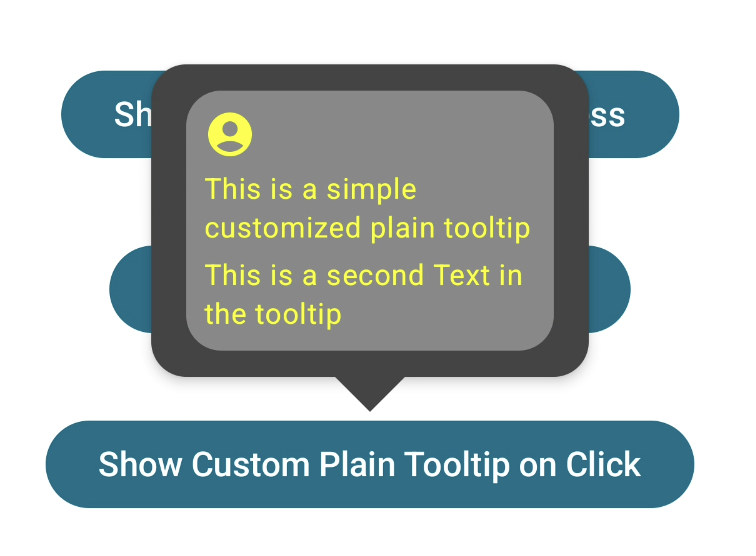 Customized plain tooltip.
Similarly, we can customize the Rich tooltip. Here is a snippet that creates a tooltip without rounded corners and custom colors.
1
2
3
4
5
6
7
8
9
10
11
12
13
14
15
16
17
18
19
20
21
22
23
24
25
26
27
28
29
30
31
32
33
34
35
36
37
38
39
40
41
RichTooltip(
    caretSize = TooltipDefaults.caretSize,
    colors = TooltipDefaults.richTooltipColors(
        containerColor = Color.Black.copy(alpha = 0.9f),
        titleContentColor = Color.Green,
        contentColor = Color.White,
    ),
    shape = RectangleShape,
    title = {
        Row {
            Icon(Icons.Default.CheckCircle, contentDescription = null)
            Spacer(modifier = Modifier.width(4.dp))
            Text("Awesome!")
        }
            },
    action = {
        Row {
            TextButton(
                onClick = {
                    scope.launch {
                        tooltipState.dismiss()
                    }
                }
            ) {
                Text("Dismiss")
            }

            TextButton(
                onClick = {
                    scope.launch {
                        tooltipState.dismiss()
                    }
                }
            ) {
                Text("Next")
            }
        }
    }
) {
    Text("You've successfully opened a rich tooltip! 🎉")
}
And this is the result.
Customized rich tooltip.
API changes in the latest 1.4.0-alpha versions
While the code above is based on the stable 1.3.2 version of the Material 3 Compose library, there have been some non-breaking changes to the Tooltip API in the 1.4.0 alpha versions. This includes:
rememberPlainTooltipPositionProviderhas been deprecated in favor ofrememberTooltipPositionProviderrememberRichTooltipPositionProviderhas been deprecated in favor ofrememberTooltipPositionProviderTooltipBoxhas a newonDismissRequest: (() -> Unit)? = nullcallback that is called when the user clicks outside of the tooltipPlainTooltipandRichTooltiphave a newmaxWidth: Dpparameter that controls how wide the tooltip can be. It defaults to the design spec of 200 dp for plain tooltips and 320 dp for rich tooltips.rememberTooltipStatenow contains a new constructor parameterinitialIsVisible: Booleanthat controls the initial visibility of the tooltip. This is useful if you want the tooltip to be shown immediately when the screen is drawn, or displayed for non-interactive elements. The default isfalse, meaning the tooltip is hidden until requested.
1
2
3
4
5
6
7
8
9
10
11
12
13
14
15
16
17
18
19
20
21
val tooltipState = rememberTooltipState(isPersistent = true, initialIsVisible = false)
val scope = rememberCoroutineScope()
Column(horizontalAlignment = Alignment.CenterHorizontally) {
    TooltipBox(
        positionProvider = TooltipDefaults.rememberTooltipPositionProvider(),
        onDismissRequest = {
            // This is called when the tooltip is dismissed
            tooltipState.dismiss()
        },
        tooltip = { PlainTooltip(maxWidth = 100.dp) { Text("This is a simple plain tooltip") } },
        state = tooltipState
    ) {
        Button(onClick = {
            scope.launch {
                tooltipState.show()
            }
        }) {
            Text(text = "Show Plain Tooltip on Click")
        }
    }
}
This is an example that uses the new dismiss callback to manually hide the tooltip. It also sets the width of the tooltip to 100.dp, causing it to wrap the text in multiple lines.
 Plain tooltip with 100.dp max width.
You can find the full implementation in the alpha branch of the sample repository on GitHub.
Showing more than one tooltip at a time
If we try to display multiple tooltips at once, we’re going to see that it’s not possible. This is because the Tooltip API has a global logic that only a single tooltip can be displayed at a time. The rememberTooltipState() function accepts a mutatorMutex: MutatorMutex parameter used to sync the tooltips. It defaults to BasicTooltipDefaults.GlobalMutatorMutex which is a static instance and therefore the same across all tooltips.
If we want to show two (or more) tooltips at once, we have to pass our instance of MutatorMutex to rememberTooltipState().
1
2
3
4
5
val tooltipState1 = rememberTooltipState(isPersistent = true)
val tooltipState2 = rememberTooltipState(
    isPersistent = true,
    mutatorMutex = MutatorMutex()
)
We can then call tooltipState1.show() and tooltipState2.show() on a button click for example to display both tooltips at the same time.
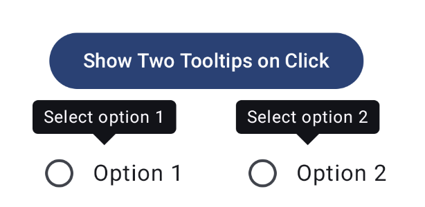 Showing two tooltips at once.
Conclusion
The Material Design 3 library in Compose provides out-of-the-box support for displaying tooltips. The API is easy to use and allows a fair level of customization in terms of the design and behavior.
We’ve taken a look at how to use the API and various changes in the latest alpha version of the library. You should now be able to use tooltips in your apps without needing an external library.
You can check the full sample for both stable and alpha versions of the library in this sample repository on Github.
References: