Swipe-to-Dismiss with Compose Material 3
Compose Material 3’s SwipeToDismissBox provides a straightforward way to add swipe gestures to your list items.
The swipe-to-dismiss component allows users to dismiss or update an item by swiping it to the left or right. Compose Material 3 offers an easy-to-use component that handles everything for us.
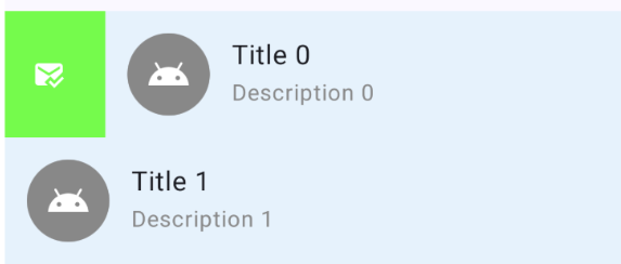 Swipe to dismiss in action.
This article is based on Compose Material 3 version 1.4.0 and 1.5.0-alpha11 and is correct at the time of writing. Later versions might include API changes that make this article irrelavant.
Why another guide to the Swipe-to-Dismiss component?
I recently had to implement the swipe-to-dismiss feature in one of my sample projects. I found that all online resources, including the official Android documentation, reference the deprecated version of the component.
There was a change related to SwipeToDismissBox in the 1.4.0-alpha16 release of Compose Material 3:
SwipeToDismissBoxStatereferences toconfirmValueChangehave been marked deprecated. Users should instead leverageSwipeToDismissBoxAPIonDismissedcallback. (Iee780)
Based on this, I have decided to post this guide to help others who want to add the swipe-to-dismiss functionality to their apps.
Implementation guide
We’re going to add a basic implementation of swipe-to-dismiss to an app that shows a list of 30 items. It will allow swiping left and right to either mark an item as read or delete it.
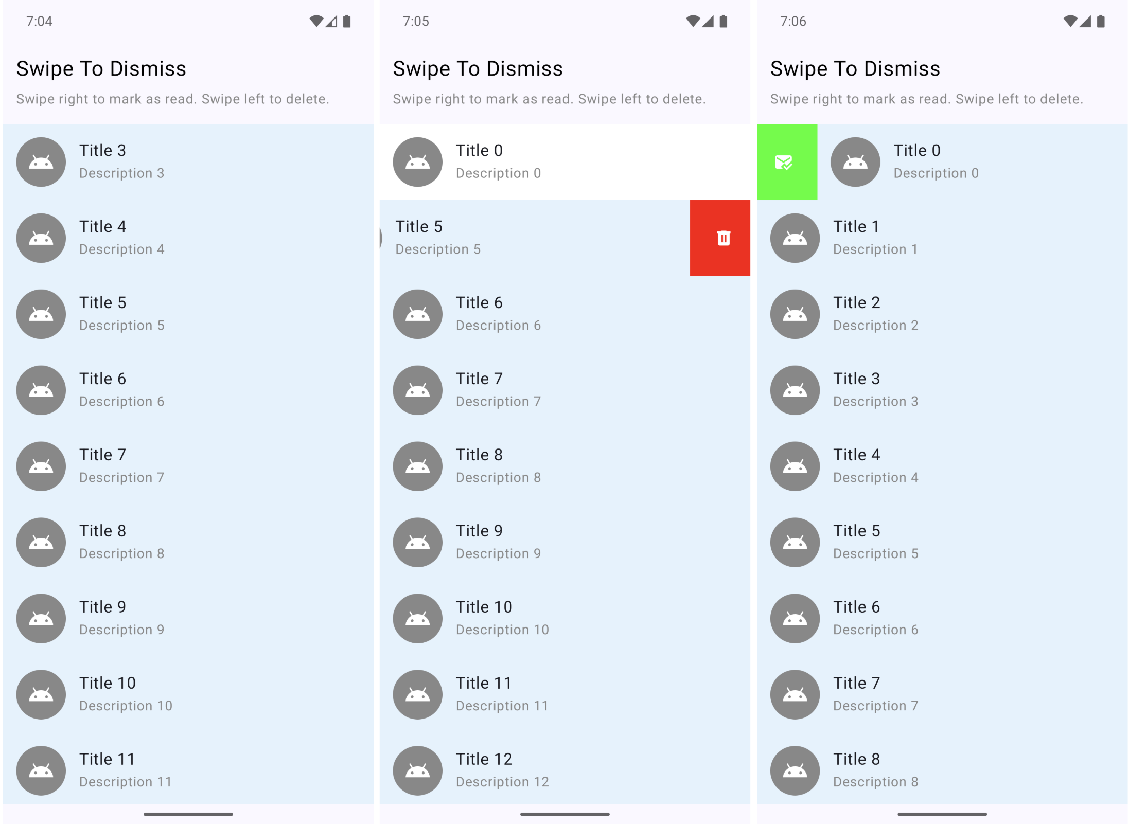 Screenshots from the final sample app.
Step 0: Prerequisites
Ensure you have the Compose Material 3 dependency added to your project.
If you’re using Compose BOM and want the packaged stable version of Compose Material 3:
1
2
3
4
5
6
7
8
9
10
11
// libs.versions.toml
[versions]
composeBom = "2025.12.01"

[libraries]
androidx-compose-bom = { group = "androidx.compose", name = "compose-bom", version.ref = "composeBom" }
androidx-compose-material3 = { group = "androidx.compose.material3", name = "material3" }

// app/build.gradle.kts
implementation(platform(libs.androidx.compose.bom))
implementation(libs.androidx.compose.material3)
If you prefer the latest alpha version of the library, specify the version explicitly:
1
2
3
4
5
6
7
8
9
10
11
12
// libs.versions.toml
[versions]
composeBom = "2025.12.01"
composeMaterial3 = "1.5.0-alpha11"

[libraries]
androidx-compose-bom = { group = "androidx.compose", name = "compose-bom", version.ref = "composeBom" }
androidx-compose-material3 = { group = "androidx.compose.material3", name = "material3", version.ref = "composeMaterial3" }

// app/build.gradle.kts
implementation(platform(libs.androidx.compose.bom))
implementation(libs.androidx.compose.material3)
Step 1: Create the State
First, create the dismiss state using rememberSwipeToDismissBoxState. This will allow us to control the behavior and detect when swipes happen.
Make sure to use the version without the
_confirmValueChange_parameter as that is the deprecated one!
1
2
val dismissState = rememberSwipeToDismissBoxState(
positionalThreshold = SwipeToDismissBoxDefaults.positionalThreshold)
The positionalTreshold property is still a bit of a mystery to me. Based on the name and the description, one would assume it controls how far the user has to drag/swipe the item before the action is triggered. However, I’ve tried using the default SwipeToDismissBoxDefaults.positionalTreshold which sets it to 56.dp, as well as it, it * 0.1f, and similar, and have not noticed any difference. Let me know in the comments if you have any ideas.
Step 2: Set Up SwipeToDismissBox
Wrap your list item content with SwipeToDismissBox. This is the component that provides swipe gestures on our composables. It requires four main parameters:
state: the dismiss stateonDismiss: callback triggered when swipe completes. This is where you can check the direction and perform your action.backgroundContent: what’s revealed behind the item during swipecontent: the content composable that will be swipeable
1
2
3
4
5
6
7
8
9
10
11
12
13
14
15
16
17
18
19
20
21
22
23
24
25
26
27
28
29
30
31
32
val coroutineScope = rememberCoroutineScope()

SwipeToDismissBox(
    state = dismissState,
    onDismiss = { dismissValue ->
        when (dismissValue) {
            SwipeToDismissBoxValue.StartToEnd -> {
                coroutineScope.launch {
                    dismissState.reset()
                    onMarkAsRead()
                }
            }
            SwipeToDismissBoxValue.EndToStart -> {
                coroutineScope.launch {
                    dismissState.reset()
                    onDelete()
                }
            }
            SwipeToDismissBoxValue.Settled -> {
                // no action
            }
        }
    },
    backgroundContent = {
        // Background revealed during swipe
        BackgroundSwipeContent(dismissState)
    },
    content = {
        // Your list item content
        ListItemContent(item = item)
    }
)
We’re using coroutineScope to be able to call dismissState.reset() which will snap back the item after the action is triggered. The onMarkAsRead is then called after the swipe has settled. You can leave this out if you don’t want to animate the item back to its original position.
Step 3: Create the Background Content
The background is what users see when swiping. We can change the color and icon based on the swipe direction or progress, which we get from dismissState.
1
2
3
4
5
6
7
8
9
10
11
12
13
14
15
16
17
18
19
20
21
22
23
24
25
26
27
28
29
30
31
32
33
34
35
@Composable
private fun BackgroundSwipeContent(swipeDirection: SwipeToDismissBoxValue) {
    val color by animateColorAsState(
        when (swipeDirection) {
            SwipeToDismissBoxValue.StartToEnd -> Color(0xFF4CAF50)
            SwipeToDismissBoxValue.EndToStart -> Color(0xFFF44336)
            SwipeToDismissBoxValue.Settled -> Color.LightGray
        },
        label = "background color"
    )
    val alignment = when (swipeDirection) {
        SwipeToDismissBoxValue.StartToEnd -> Alignment.CenterStart
        SwipeToDismissBoxValue.EndToStart -> Alignment.CenterEnd
        SwipeToDismissBoxValue.Settled -> Alignment.Center
    }
    val iconResId = when (swipeDirection) {
        SwipeToDismissBoxValue.StartToEnd -> R.drawable.ic_mark_read
        SwipeToDismissBoxValue.EndToStart -> R.drawable.ic_delete
        SwipeToDismissBoxValue.Settled -> R.drawable.ic_mark_read
    }

    Box(
        modifier = Modifier
            .fillMaxSize()
            .background(color)
            .padding(horizontal = 20.dp),
        contentAlignment = alignment
    ) {
        Icon(
            painter = painterResource(iconResId),
            contentDescription = null,
            tint = Color.White
        )
    }
}
Step 4: Use in a LazyColumn
When using with LazyColumn, make sure to provide a stable key for proper item tracking:
1
2
3
4
5
6
7
8
9
10
11
12
13
LazyColumn(modifier = Modifier.fillMaxSize()) {
    items(items = items, key = { it.id }) { item ->
        SwipeableListItem(
            item = item,
            onMarkAsRead = {
                // do something
            },
            onDelete = {
                // do something
            }
        )
    }
}
Step 5: Final result
After wrapping up the item in SwipeToDismissBox we now have the following behavior, which is exactly what we wanted.
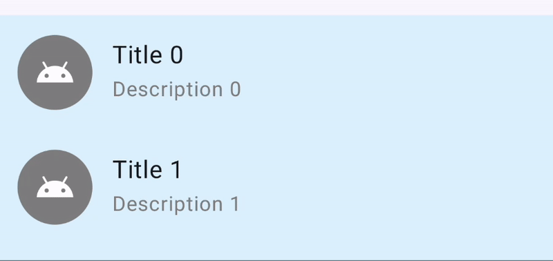 Final result showing how the swipe-to-dismiss works.
You can find the whole sample on GitHub at the https://github.com/landomen/ComposeMaterial3SwipeToDismissSample repository.
Conclusion
Compose Material 3’s SwipeToDismissBox provides a straightforward way to add swipe gestures to your list items. Key points to keep in mind:
- Use the correct
rememberSwipeToDismissBoxState: make sure to use the version without the_confirmValueChange_parameter as that is the deprecated one! - Reset after action: Call
dismissState.reset()if you want the item to snap back after the action is triggered. Skip reset if the item will be removed. - Swipe directions:
StartToEndis a left-to-right swipe,EndToStartis right-to-left.
That’s it for this one. Let me know in the comments your experience with using swipe-to-dismiss in Compose Material 3.
Resources: