Exploring 5 Lesser-Known Compose Components
We explore lesser known components in Compose Material 3 such as TriStateCheckbox, RangeSlider, SegmentedButton, and others.
Jetpack Compose Material 3 brings a rich set of UI components — but beyond Buttons, TextFields, and Cards lie many lesser-known components that can help us save time and provide a better user experience.
In this article, we’ll explore some of these hidden components and see when and how to use them.
Note: the examples in this article should work between all versions of Compose Material 3: production (
1.3.2), beta (1.4.0-beta02) and alpha (1.5.0-alpha04) as the API has not changed.
1. TriStateCheckbox
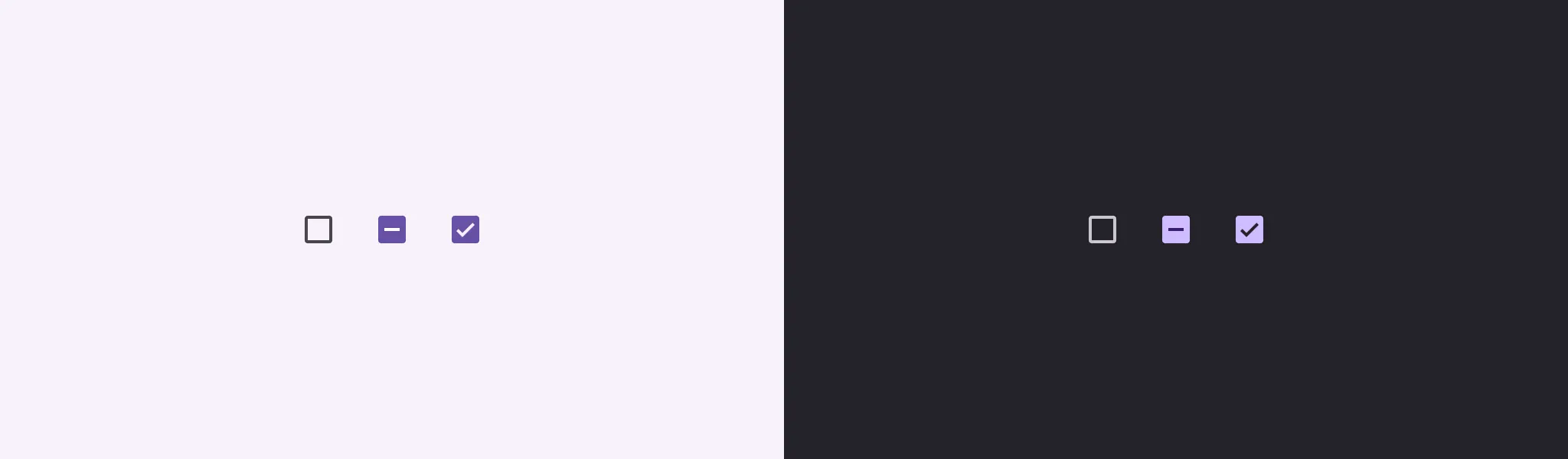
A regular checkbox supports two states: on and off. TriStateCheckbox adds a third state: indeterminate. It represents a state when something is either not fully checked or not fully unchecked.
The documentation on TriStateCheckbox has the image below, which shows all three states.
 Source: https://developer.android.com/images/reference/androidx/compose/material3/indeterminate-checkbox.png
What is the use case for this component? It’s mostly meant to be used as a parent checkbox that represents the state of all child checkboxes:
- When all child checkboxes are unchecked -> the parent
TriStateCheckboxis unchecked/off - When not all child checkboxes are checked or unchecked -> the parent
TriStateCheckboxis in an indeterminate state (not off nor on) - When all child checkboxes are checked -> the parent
TriStateCheckboxis checked/on
 Example of all three states of the TriStateCheckbox
Here is how we can implement the above selection. Another important feature is that clicking on the TriStateCheckbox changes the state of all the child checkboxes.
1
2
3
4
5
6
7
8
9
10
11
12
13
14
15
16
17
18
19
20
21
22
23
24
25
26
27
28
29
30
31
32
33
34
35
36
37
38
39
40
41
42
@Composable
private fun TriStateCheckboxSample() {
    var childStates by remember { mutableStateOf(List(5) { false }) }

    // Determine parent state
    val parentState = when {
        childStates.all { it } -> ToggleableState.On
        childStates.none { it } -> ToggleableState.Off
        else -> ToggleableState.Indeterminate
    }

    Column(Modifier.padding(16.dp)) {
        // Parent checkbox
        Row(verticalAlignment = Alignment.CenterVertically) {
            TriStateCheckbox(
                state = parentState,
                onClick = {
                    val newState = parentState != ToggleableState.On
                    childStates = List(childStates.size) { newState }
                }
            )
            Text("Options")
        }

        Spacer(Modifier.height(8.dp))

        // Child checkboxes
        childStates.forEachIndexed { index, checked ->
            Row(verticalAlignment = Alignment.CenterVertically, modifier = Modifier.padding(horizontal = 16.dp)) {
                Checkbox(
                    checked = checked,
                    onCheckedChange = { newValue ->
                        childStates = childStates.toMutableList().apply {
                            this[index] = newValue
                        }
                    }
                )
                Text("Option ${index + 1}")
            }
        }
    }
}
And here is how it looks in action:
 Video showing how the TriStateCheckbox in action.
Fun fact: the
_Checkbox_composable is a wrapper around theTriStateCheckboxcomposable, ignoring the third indeterminate state.
2. SegmentedButton
A segmented button is a button that supports selection between two to five options. It can contain icons, text, or both.
There are two variants of the segmented button: single-choice and multi-choice. They are implemented as different components.
Single-choice segmented button
A single-choice segmented button is implemented as a SingleChoiceSegmentedButtonRow composable, to which we can add multiple SegmentedButton.
It can use the default icon, which is a checkmark, or we can supply a custom icon.
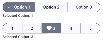 Example of a single-choice segmented button.
Here is a sample implementation of the two segmented buttons above.
1
2
3
4
5
6
7
8
9
10
11
12
13
14
15
16
17
18
19
20
21
22
23
24
25
26
27
28
29
30
31
32
33
34
35
36
37
38
39
40
41
42
43
44
45
46
var selectedIndex by remember { mutableIntStateOf(0) }
SingleChoiceSegmentedButtonRow(
    modifier = Modifier.fillMaxWidth()
) {
    (0..2).forEach { index ->
        SegmentedButton(
            selected = selectedIndex == index,
            onClick = { selectedIndex = index },
            shape = SegmentedButtonDefaults.itemShape(index, 3),
        ) {
            Text("Option ${index + 1}")
        }
    }
}

Text(
    text = "Selected Option: ${selectedIndex + 1}",
    style = MaterialTheme.typography.bodySmall
)

Spacer(Modifier.height(16.dp))

var selectedIndex1 by remember { mutableIntStateOf(0) }
SingleChoiceSegmentedButtonRow(
    modifier = Modifier.fillMaxWidth()
) {
    (0..4).forEach { index ->
        SegmentedButton(
            selected = selectedIndex1 == index,
            onClick = { selectedIndex1 = index },
            shape = SegmentedButtonDefaults.itemShape(index, 5),
            icon = {
                SegmentedButtonDefaults.Icon(selectedIndex1 == index, activeContent = {
                    Icon(Icons.Default.Favorite, null)
                })
            }
        ) {
            Text("${index + 1}")
        }
    }
}

Text(
    text = "Selected Option: ${selectedIndex1 + 1}",
    style = MaterialTheme.typography.bodySmall
)
And this is how it looks in action.
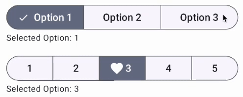 Example of using the single-choice segmented button.
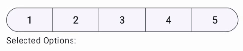
Multi-choice segmented button
A multi-choice segmented button is implemented as a MultiChoiceSegmentedButtonRow composable, to which we can add multiple SegmentedButton.
Its implementation is similar to that of SingleChoiceSegmentedButtonRow, with some slight API differences to support multiple buttons being checked at once.
 Example of a multi-choice segmented button.
Here is a sample implementation of the two segmented buttons above.
1
2
3
4
5
6
7
8
9
10
11
12
13
14
15
16
17
18
19
20
21
22
23
val selectedOptions = remember { mutableStateListOf<Int>() }
MultiChoiceSegmentedButtonRow(
    modifier = Modifier.fillMaxWidth()
) {
    (0..4).forEach { index ->
        SegmentedButton(
            checked = index in selectedOptions,
            onCheckedChange = {
                if (index in selectedOptions) selectedOptions.remove(index) else selectedOptions.add(
                    index
                )
            },
            shape = SegmentedButtonDefaults.itemShape(index, 5),
        ) {
            Text("${index + 1}")
        }
    }
}

Text(
    text = "Selected Options: ${selectedOptions.map { it + 1 }.joinToString()}",
    style = MaterialTheme.typography.bodySmall
)
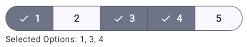
And this is how it looks in action.
 Example of using the multi-choice segmented button.
3. RangeSlider
A Range Slider is based upon the regular Slider concept, with the key difference that it allows the user to select two values. The two values form a range with one value representing the minimum and the other representing the maximum.
Example of where a RangeSlider can be used when filtering based on price, allowing the user to select the price range and showing results that fit that range.
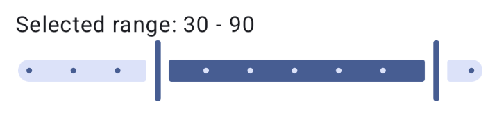 Example of a RangeSlider.
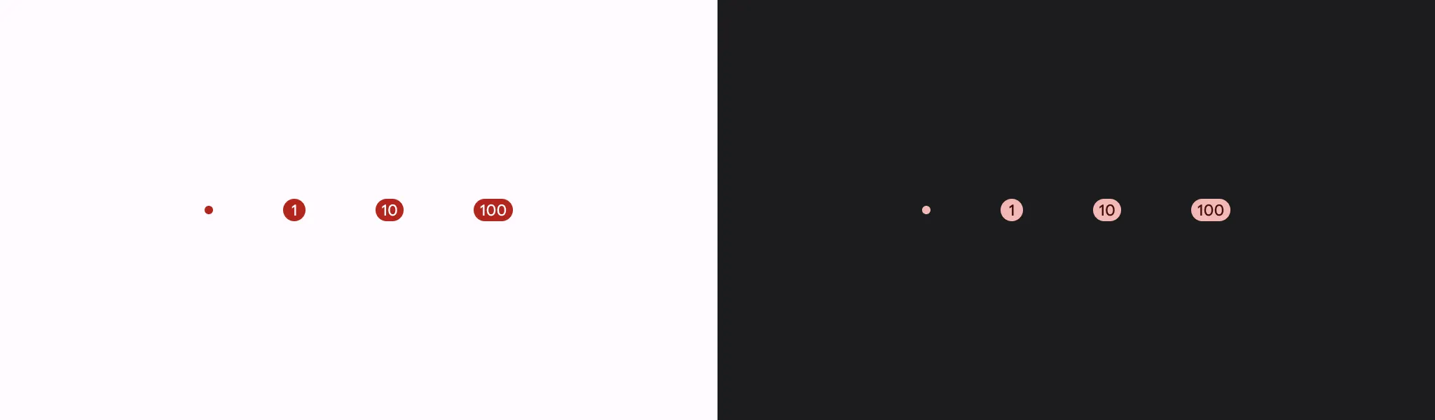
Here is a short example of how to use it. The API is similar to that of regular Slider. We have to pass in a selected value range, a valid value range that defines the minimum and maximum value, and the number of steps. In this example, we have a range of 1 to 100, with 9 steps (plus 1 that is always present), meaning that each step represents a value of 10.
1
2
3
4
5
6
7
8
9
10
11
12
13
14
15
16
17
18
19
20
@OptIn(ExperimentalMaterial3Api::class)
@Composable
private fun RangeSliderExample() {
    var selectedValue by remember { mutableStateOf(0f..100f) }

    Column {
        Text(
            text = "Selected range: ${selectedValue.start.toInt()} - ${selectedValue.endInclusive.toInt()}",
            style = MaterialTheme.typography.bodyLarge
        )

        RangeSlider(
            value = selectedValue,
            onValueChange = { newRange -> selectedValue = newRange },
            valueRange = 1f..100f,
            steps = 9,
            modifier = Modifier.fillMaxWidth()
        )
    }
}
We can drag each thumb to change the selected range. The two thumbs cannot cross each other.
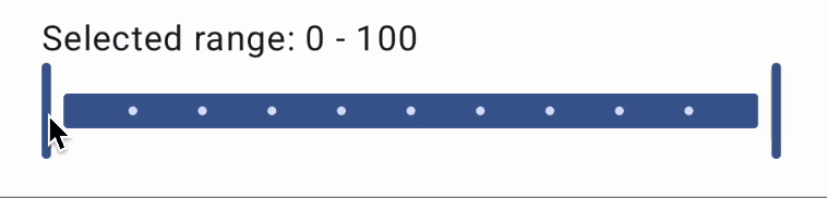 Example of using the RangeSlider.
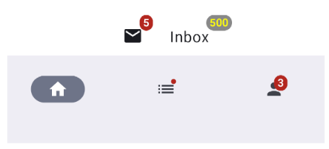
4. Badge
A badge represents a notification and is meant to draw attention to an element and notify the user that there are pending requests or actions.
It can also display a specific number of pending requests or short text.
It’s typically used in a bottom navigation bar on one of the navigation items.
 Source: https://developer.android.com/images/reference/androidx/compose/material3/badge.png
A BadgedBox is a component that wraps the component to which we want to anchor the badge. It accepts two composable functions as input arguments: one for the content, and one for the badge. It then anchors the badge to the top right of the content.
A Badge can also be customized with different backgrounds and text colors.
1
2
3
4
5
6
7
8
9
10
11
12
13
14
15
16
17
18
19
20
21
22
23
24
25
26
27
28
29
30
31
32
33
34
35
36
37
38
39
40
41
42
43
44
45
46
47
48
49
50
51
52
53
54
55
56
57
58
59
60
61
62
63
64
65
66
67
68
69
70
71
72
@Composable
private fun BadgeExample() {
    Row(
        horizontalArrangement = Arrangement.spacedBy(16.dp),
        modifier = Modifier
    ) {
        BadgedBox(
            badge = {
                Badge {
                    Text("5")
                }
            }
        ) {
            Icon(
                imageVector = Icons.Default.Email,
                contentDescription = "Messages",
                modifier = Modifier.padding(8.dp)
            )
        }

 BadgedBox(
            badge = {
                Badge(
                    containerColor = Color.Gray,
                    contentColor = Color.Yellow
                ) {
                    Text(500.toString())
                }
            }
        ) {
            Text("Inbox", modifier = Modifier.padding(8.dp))
        }
    }

    // Navigation bar example
    NavigationBar {
        NavigationBarItem(
            icon = {
                Icon(Icons.Filled.Home, contentDescription = "Home")
            },
            selected = true,
            onClick = {}
        ) NavigationBarItem(
            icon = {
                BadgedBox(
                    badge = {
                        Badge()
                    }
                ) {
                    Icon(Icons.AutoMirrored.Filled.List, contentDescription = "List")
                }
            },
            selected = false,
            onClick = {}
        ) NavigationBarItem(
            icon = {
                BadgedBox(
                    badge = {
                        Badge()
                        {
                            Text(3.toString())
                        }
                    }
                ) {
                    Icon(Icons.Filled.Person, contentDescription = "Profile")
                }
            },
            selected = false,
            onClick = {}
        )
    }
}
The above example shows a badge above an icon, a customized badge above text, and badges inside a navigation bar.
 Examples of using a Badge and BadgedBox.
5. Tooltip
You can find more details on the Tooltip composable in a separate article: Tooltips in Compose Material 3.
Conclusion
We’ve taken a closer look at some of the lesser-known components in Compose Material 3. You should now be ready to confidently add these overlooked components to your Compose toolkit to make your apps feel more polished and interactive.
Let me know in the comments if you use these components and if there are any other interesting components you’ve discovered.
Consider clapping if this article was helpful, and consider following me for more Android content.