Creating an Animated Counter Button in Jetpack Compose
Let’s create an animated counter button in Jetpack Compose step-by-step.
I recently needed to create a counter button for a simple app. Browsing the internet for inspiration, I stumbled across this design on Dribble by Ehsan Rahimi. Deciding it would be a good challenge to re-create it in Compose, I started playing around with it. Let’s build it together one step at a time.
Note that we will try to match the designs as much as possible, but there is much room left for improvement in the final version to make it feel even smoother and closer to the original.
Creating the initial layout
We’ll start by creating the initial layout without any animations or dragging functionality. We can break the design down into two main components: the draggable thumb and the rounded button layout with decrease, clear, and increase icons.
We also need a root layout to hold those two components. Since the clear button is hidden underneath the draggable thumb, and the thumb can be dragged vertically outside of the bounds of the button, we need to use a Box as it allows overlapping elements.
Let’s now take a look at the ButtonContainer composable which houses the icon buttons. We will use a Row since three buttons needto be positioned horizontally. We can use Arrangement.SpaceBetween to horizontally position the buttons to the start, center, and end. The buttons are represented as IconControlButton composable, which is just a wrapper around the IconButton.
Note: to use the same icons you will need to either add a dependency to
androidx.compose.material:material-icons-extendedor add icons manually to the project.
To get the necessary background shape, we can use the clip(RoundedCornerShape()) modifier and set the background color. We’re also changing the alpha value of the background color as we will later need to animate it as the thumb is dragged. And same for the buttons’ tint color. We are hiding the clear button for now as we will leave the logic of it for the end.
Note: it’s not recommended to hardcode colors like this, as this will cause issues with the light/dark theme. This is only done to keep the code short for this article.
To implement the thumb button we can use a Text composable wrapped in a Box so that we can apply the CircleShape clip and shadow to it to create a circle button effect. And we will use the .clickable {} modifier to support clicks.
Finally, let’s actually use the CounterButton composable.
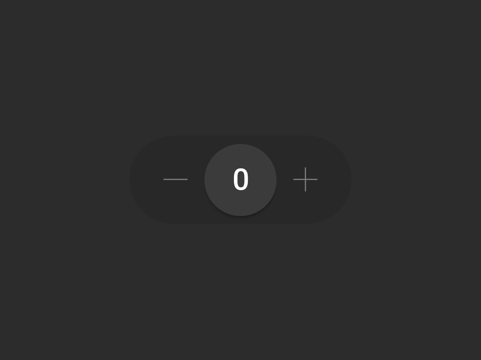
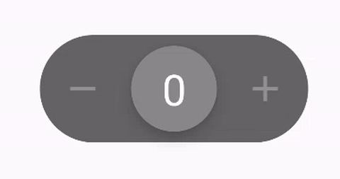
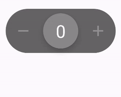
With all of this in place, we can run the code and get the following result. This is our starting point as we add the counter logic and dragging support.
 Result of the initial composables.
Adding counter logic
We’ve left a few TODOs for the value-click listeners in the initial layouts. Let’s now add the logic to increase and decrease the counter value. We want to keep the value state outside of the button composable, so let’s hoist the state and add click listeners as arguments of the CounterButton composable.
Next, we have to define a mutable state for our counter that we will update on each button click event. We will put it at the top level as this would usually be in your ViewModel.
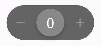
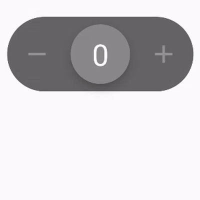
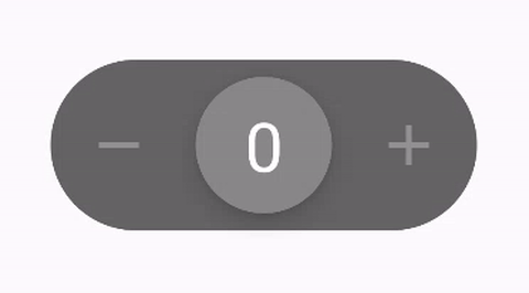
And with that, we now have a functioning counter button. We can click on the thumb or the decrease and increase buttons to change the value. The clear value button is currently not used as it’s hidden behind the thumb, but we will fix that later when we add vertical dragging.
 Clickable counter button.
Supporting horizontal dragging
So far we have built a working counter button. Now let’s add the main functionality, which is dragging the thumb to increase or decrease the value.
First, we’re going to define two new variables inside the DraggableThumbButton composable. The first one is thumbOffsetX: Animatable which is going to help us position and animate the thumb button as we drag it. The second one is a coroutine scope which is needed to update the thumbOffsetX and run the animation.
Next, we’ll add a .offset modifier to the thumb Box, which defines the offset of the composable from its original position. We’re going to use the value of thumbOffsetX for the x-axis and leave the yy-axisat 0 for now.
Next, we need to actually detect the dragging gesture. One way to do that is to use the .pointerInput modifier which gives us a PointerInputScopefrom which we can call forEachGesture and awaitPointEventScope functions. This allows us to process each touch event when it occurs and we can use awaitFirstDown() to wait for the initial event. Then we’re using a do-while loop to process events while user is pressing down. This way we can get the x value of the event that we can apply to the thumb as offset. We are using the .snapTo(value) function, which sets the target value without any animations.
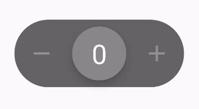
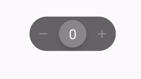
We can now drag the thumb left and right as we wish. However, as you can see there is still work that needs to be done. The thumb can be dragged outside of the bounds of the button, it doesn’t returns to its original position, and touching it also increases the value.
 Initial horizontal dragging.
Adding limits to dragging
Let’s add some limits to how far the thumb can be dragged. First, we have to define the maximum value for the dragging. We need a value in pixels, and for the sake of simplicity, we will hardcode the limit. Ideally, we would get the width of the ButtonContainer composable and calculate this dynamically. But for now, we’re just defining a static value in dp and converting it to pixels using the Density.toPx() function for which we need to get the LocalDensity.current object from the CompositionLocalProvider.
Next, the key piece is that we are limiting the minimum and maximum targetValue so that it’s within the range of [-dragLimitHorizontalPx, dragLimitHorizontalPx]. We’re utilizing the coerceIn(minimumValue: Float, maximumValue: Float) function from the Kotlin standard library that does exactly that, it makes sure that the value is within the provided range.
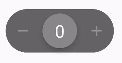
With these few simple changes, we get the following result:
 Horizontal dragging with limits.
Increasing and decreasing the value as a result of dragging
Right now, the user can drag the thumb to the border of the button, but nothing happens. Let’s detect this and either increase or decrease the value, as if the user pressed the decrease and increase buttons.
First, let’s update the DraggableThumbButton composable to accept two new arguments: a lambda for decreasing the value and another one for increasing the value.
Next, we have to detect that the thumb was dragged to the limit and call the appropriate function depending on the drag direction: left or right.
How can we know when the user has released the thumb and is no longer dragging it? The do-while loop condition will no longer be true and we can add any logic after it.
After the user releases the thumb, we’re checking if the absolute value of the thumb is close to the max drag limit and then we’re checking the drag direction to call the correct function.
 Horizontal dragging with value increase and decrease.
This works, but the thumb remains where we stopped dragging. We’ll fix that shortly.
Adding spring animation
We want the thumb to return to the center when the user stops dragging it. We’ve learned in the previous section that once the do-while loop stops, it means that the user has released the thumb. That means that all we need to do is update the thumbOffsetX.value back to 0 once that happens.
We can do that by launching a new coroutine after the limit detection to update the thumbOffsetX object using the animateTo() function. It accepts a target value and the animation spec. We can use the spring animation to get the bounce effect from the original design.
Animated position reset after dragging.
You can play around with the animation spec to get an even smoother effect.
Moving the whole button
If we take a look at the original design, we can see that when the thumb is dragged, the whole button moves in the same direction. To achieve that, we need to know the position of the thumb at a higher level.
Therefore, let’s hoist the thumbOffsetX definition from DraggableThumbButton to CounterButton composable. Then we can pass the value of thumbOffsetX to the ButtonContainer composable and use it to offset the button.
Now that we’ve moved thumbOffsetX to CounterButton composable, we can pass the value to ButtonContainer composable and use it in the .offset {} modifier to move the whole button Box. We will multiply the offset by a factor of 0.1f to only move the button a small amount compared to the thumb.
Finally, we have to change the value of dragLimitHorizontalPx in DraggableThumbButton composable from 60.dp to 72.dp and move it to a separate constant. This change is needed, as we are now moving the whole button causing the thumb to no longer touch the sides.
After making the changes we get the following result:
 The button container moves along with the thumb.
Fixing unwanted clicks
In the initial layout composable we applied a .clickable modifier on the thumb that allowed us to increase the value when the thumb is clicked. However, after adding the dragging logic, any touch on the thumb results in a click.
 Unwanted clicks cause the value to increase on minor dragging.
To fix that, we can add a check to only allow clicks when the thumb is not being dragged and is in the initial position. We can also define some minor threshold to what should be considered static position.
After adding this check, the issue is fixed and the thumb is only clickable when it’s at its default position:
 Slightly dragging the thumb no longer increases the value unwantedly.
Adding drag resistance
The current dragging logic works, but it feels a bit plain. We can address that by adding a bit of resistance to the thumb-dragging motion. Right now, we are simply taking the position change value and adding it to the current thumb offset, which results in a linear dragging motion. To create a bit of resistance, we can multiply the position change by a certain factor less than 1. This way, the closer the thumb is to the edge, the more effort it takes to drag it.
Because it’s now harder to reach the edge of the button, we have to update the check for when we consider the thumb to be dragged enough to trigger a value increase or decrease. We can multiply the dragLimitHorizontalPx by some factor less than 1, so there is a bit of a leeway.
With the updated offset calculation, it takes more effort to fully drag the thumb:
 Dragging the thumb to the border.
Highlighting the increase and decrease icons
The decrease and increase icons should start as barely visible and should become more visible the closer the thumb is dragged to them.
Let’s update the ButtonContainer composable and define a new value for the point where the icon should become fully visible. We can use the current thumb offset and the new value to calculate the percentage and use that as the alpha value of the tint color. We are also limiting the alpha to at least 30%. We will update the logic for the clear button later.
With the new calculation, the icons get more visible as we drag the thumb closer to the edge:
 Highlighting the icons as a result of dragging the thumb.
Highlighting the button background color
In a similar fashion to the icons, we can use the dragging progress to update the ButtonContainer background, so that the background color gets darker the more the thumb is dragged to the edge. We are limiting the alpha value to be at least the initial value plus some minor factor of the progress.
And here is the result of this small change. Feel free to play around with the numbers to achieve a different result.
 Dragging the thumb closer to the border darkens the background.
Adding support for vertical dragging
We have the horizontal dragging working as we wanted, now let’s add support for vertical dragging which should reset the current counter value.
We’ll start by defining a new thumbOffsetY: Animatable property in the CounterButton composable that we will use to control the y offset, in a similar way to the existing thumbOffsetX property.
Next, let’s update the .offset modifier to also observe thumbOffsetY so that the thumb position is vertically updated. And we have to update the .clickable modifier as well to avoid unwanted clicks in case of a vertical drag.
As a next step, let’s define a new enum class DragDirection, and a new mutable property called dragDirection: DragDirection that we will use to keep track of the dragging direction state. This will allow us to only allow one-dimensional dragging, preventing dragging horizontally and vertically at the same time.
We also have to define a new dragLimitVerticalPx variable that will control how far the thumb can be dragged vertically.
Next, we have to write the logic for detecting vertical dragging inside the existing .pointerInput modifier.
The first step is to detect in which direction the drag is happening: horizontal or vertical. We can determine that by checking if either pointerInputChange.positionChange().x or pointerInputChange.positionChange().y has changed. But because even in the case of a vertical drag, the x position can change slightly, we also need to check that the value is greater than some threshold to avoid detecting the wrong direction.
Once we have determined the direction of the drag, we can then update either the thumbOffsetX or thumbOffsetY property to move the thumb.
We also have to use the dragDirection variable to control the direction of dragging to only allow dragging in one direction at a time.
With the dragging in both directions now working, we have to add the logic for detecting vertical drag to the limit. Once the thumbOffsetY value crosses the dragLimitVerticalPx value (with some leeway), we trigger the onValueReset() callback that resets the counter.
Finally, we have to update the reset logic in case a drag happened. We need to first check the drag direction and then reset either the thumbOffsetX in case of a horizontal drag or thumbOffsetY in case of a vertical drag so that the thumb returns to its original position.
With all of the above changes, vertical dragging should now be working, and dragging the thumb down should reset the value back to zero:
 Working vertical drag.
Showing the clear icon
We want to start displaying a clear icon when the thumb is dragged vertically. We’ll start by defining the point after which the icon should appear, to avoid showing it in case of a minor drag. And we need to set the clearButtonVisible argument on the ButtonContainer.
 Showing the clear icon.
With this change, the clear icon becomes visible when dragging the thumb vertically and it remains hidden when dragging it horizontally.
Next, let’s make the clear icon more visible the closer the thumb is dragged to the limit. To do that we need to know the value of thumbOffsetY inside the ButtonContainer composable so that we can calculate the progress. Additionally, we’ll define a new verticalHightlightLimitPx property and use it together with thumbOffsetY to calculate the tintColor property.
The clear icon now becomes more visible the more the thumb is dragged to the limit.
 Making the clear icon more visible.
Moving the whole button vertically
Similar to how the whole button container moves slightly in the direction of a horizontal drag, it should also move in case of a vertical drag. Let’s update the .offset modifier in the ButtonContainer composable to use the thumbOffsetY value so the whole button follows the thumb when it’s dragged vertically. And also update the .background modifier to set a darker background color the more the thumb is dragged vertically. We are also updating our calculations for the horizontal dragging here and making sure its value isn’t greater than the new CONTAINER_BACKGROUND_ALPHA_MAX constant.
 Moving the button vertically.
Hiding the increase and decrease buttons in case of a vertical drag
As a next step, we want to hide the decrease and increase buttons in case of a vertical drag. We need to update the tint color calculation for those two buttons and set them as invisible.
With this change, the increase and decrease icons become invisible when starting a vertical drag.
 Hiding the increase and decrease buttons in case of a vertical drag.
Disabling button clicks while dragging
While the buttons are not actually visible, they are still clickable. So let’s define a new argument enabled for the IconControlButton and set it to false for the clear button as it should never be clickable. And decrease and increase buttons should only be disabled in case of a vertical drag.
Adding a fast counter
The user can now increase the value by either clicking on the thumb, clicking on the increase button, or dragging the thumb to the right edge. But what if we want to increase the value quicker and by a larger amount?
For fun, let’s add a quick counter in case the user drags the thumb to the right or left edge and leaves it there for a while.
We’re going to do that by launching a coroutine when the thumb is first dragged and then using the delay suspend function to keep checking if the thumb is still at the edge every interval.
We’re also keeping track of the Job object and canceling it after the user releases the thumb.
Now if we drag the thumb to the edge and leave it there for a moment, the value should start increasing or decreasing quickly.
 Adding logic for quickly increasing and decreasing the value.
Changing the highlight color on the icon buttons
As a last step, let’s make the increase and decrease buttons change the icon color to white when pressed. To do that, we have to define our interactionSource and get the isPressed state from. We can use that state to change the icon tint color.
Now when the buttons are pressed, the icons are displayed as white.
 Showcase of the completed counter button.
Final result
We’ve now built our animated counter button in its entirety and the final result should look like this:
 Changing icon color when pressed.
I know this was a long guide, so thank you for sticking around and hopefully, you’re satisfied with the results. Feel free to play around with the values and animations to create an even better approximation of the original design, or create your own versions.
You can find the final version of the code in this GitHub gist.
Improvement ideas
- Add haptic feedback when the user reaches the drag limit to notify that value was changed.
- Optimize the performance of the composable by using Layout Inspector.
Note: there were some shortcuts taken in this guide to keep it simple. You might want to address any issues you find in case you plan to use the result in production.